
Know yourself

Every day, Pinterest sends me images that the algorithm thinks I’ll enjoy, sometimes with irritating headers: “Ingrid, these pins are so you!” but usually with titles that will actually get me to look: “Still life oil paintings we think you’ll like”.
Ever on the lookout for artwork to appreciate, I check out the recommendations and save some eye candy to my Pinterest board under “Inspiring Art”. Over time, this board has become a good representation of my taste in art and a huge help in my art making.
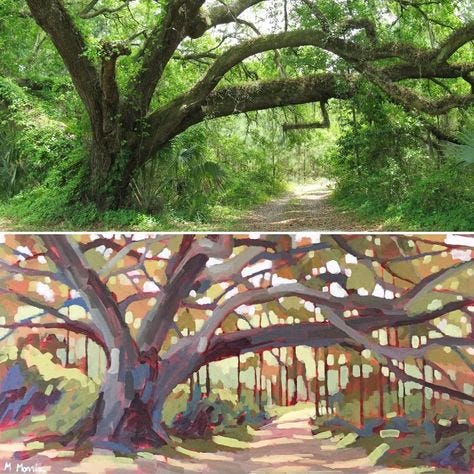
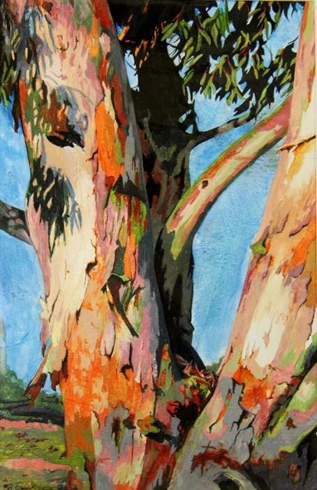
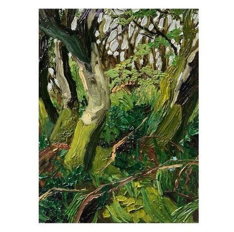
Recently “Tree paintings for you” showed me this selection, all of which were very good, but only one of which I saved to Inspiring Art.
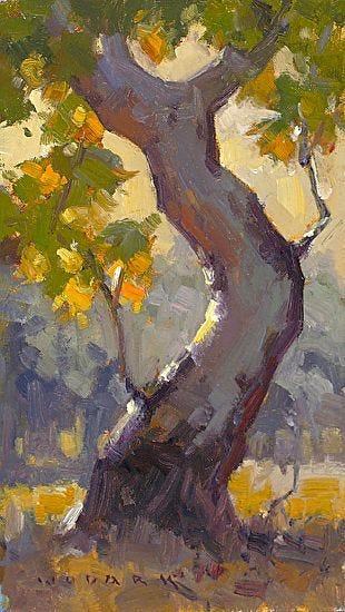
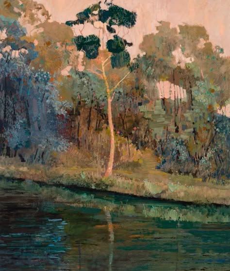
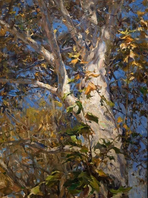
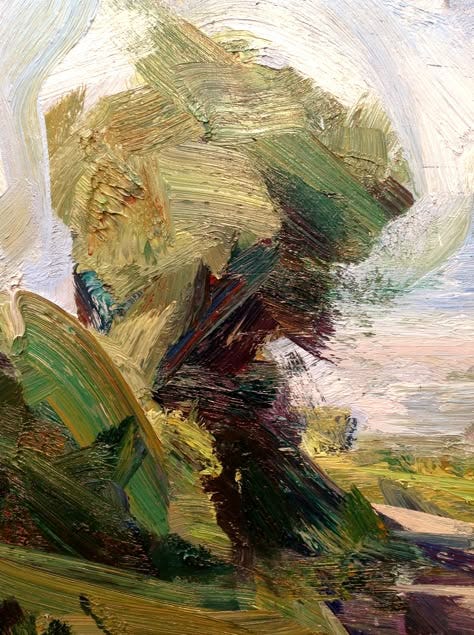
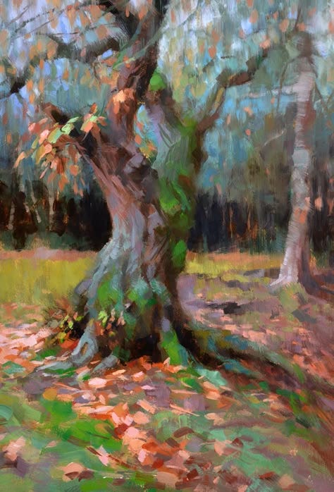
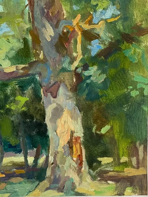
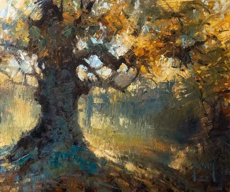
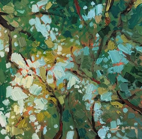
You might be surprised to know that I chose number 4 which is by Tai-Shan Schierenberg. It was the one that caught my roving eye and held it because it was the one that felt the most unique. I’ve seen a lot of painted trees over the years, but I haven’t seen any quite like this. It’s vigorous, crude and rather grubby and, inexplicably, evokes an emotional connection in me. I’d happily hang this painting on my wall.
Knowing what speaks to me is vital as a painter. If I didn’t have a clear understanding of what I liked, I’d struggle to paint an honest painting, one that represents how I see the world - or want to see the world. Self knowledge closes unpromising avenues and funnels me toward my unique aesthetic. And we each have a unique aesthetic.
The more that I make these sorts of selections, the clearer I become in my mind about what I want my paintings to look like. Paintings can go in so many directions. I could choose high chroma mixtures or neutralized colour, hard edges or lost, refined finishes or crude, big simple shapes or small, intricate ones, small details or none…. The list goes on and I can only make decisions based on my knowledge of my preferences.
Over the years, I’ve become clearer about what I like and that’s what I try to put on the canvas each day. Each painting, no matter the subject matter, is a self portrait, showing the viewer what I think is interesting and worth painting.
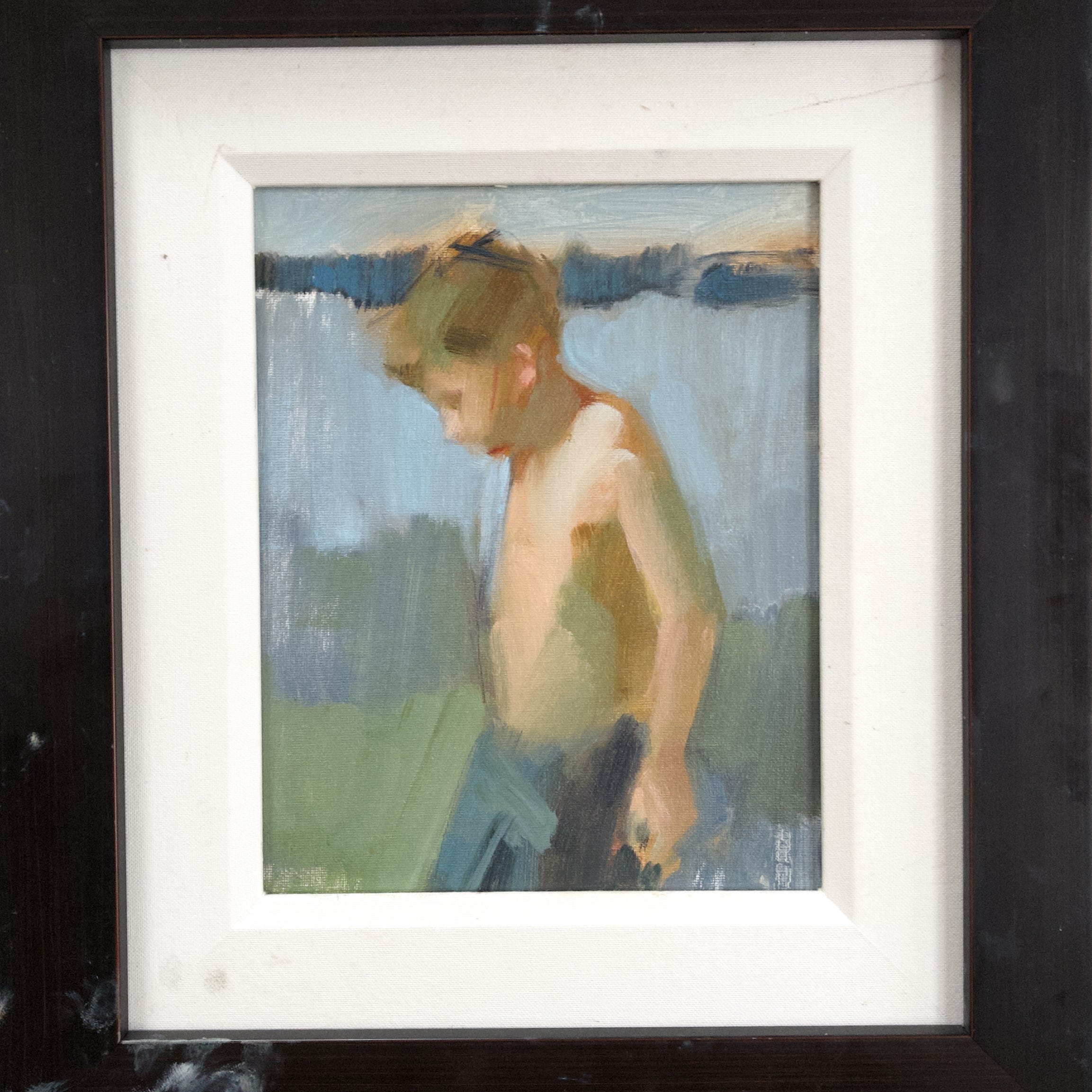
I’ve just embarked on a practise of small, beachy sketches on inexpensive supports that I do at the end of the painting day to use up some of the mixtures on my palette. Unlike the other practises that I’ve started and dropped (looking at you, daily drawing), this one might be a keeper. I look forward to it every day as an antidote to the intense concentration and sometimes frustration of more significant pieces.
It started with a couple of works on paper done with Flashe paint which went unexpectedly well and made me happy. The paper had a lot to do with that feeling since it’s not the financial commitment that oil primed linen is.
Next I worked oil on paper
And then oil on inexpensive canvas boards
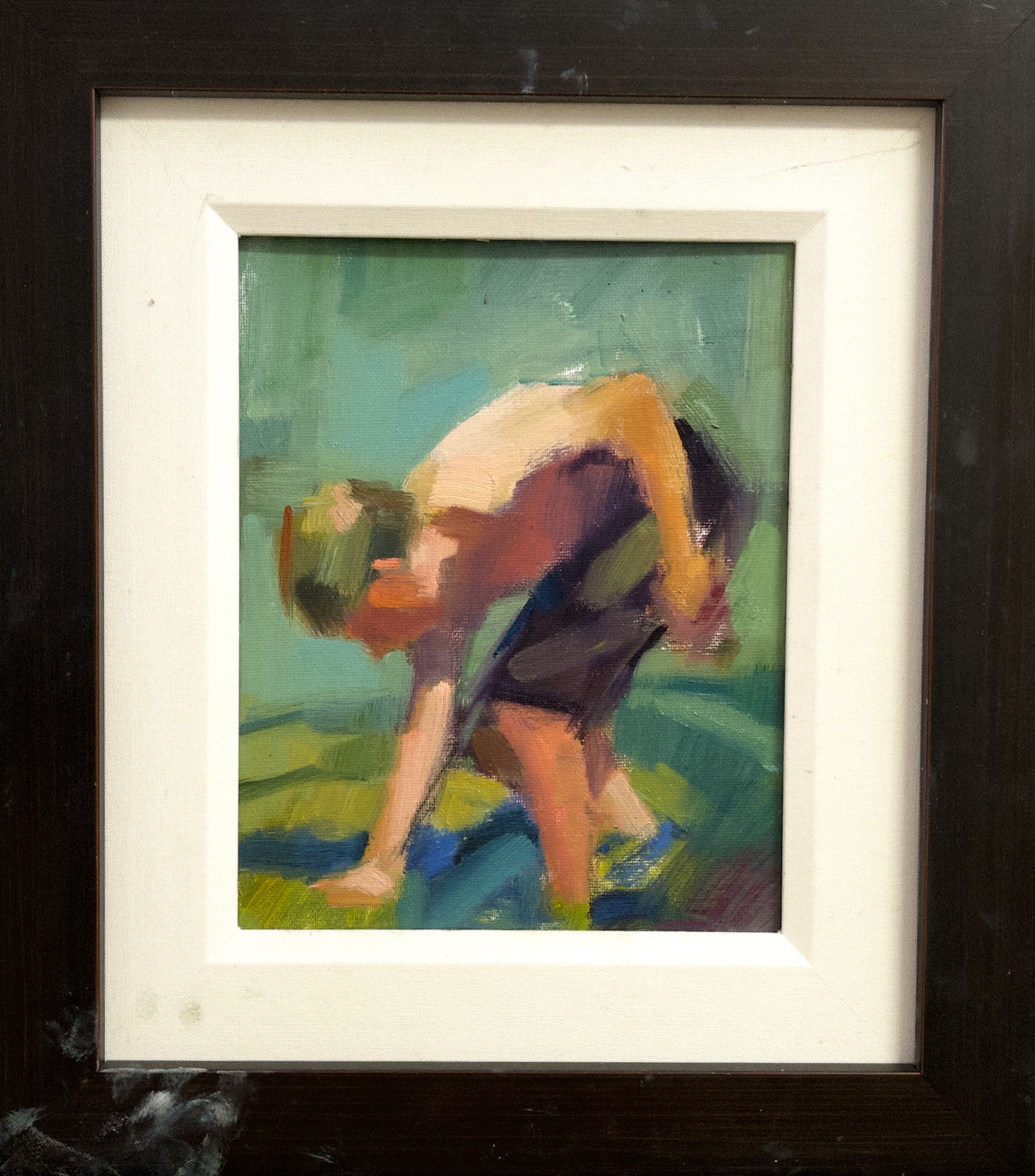
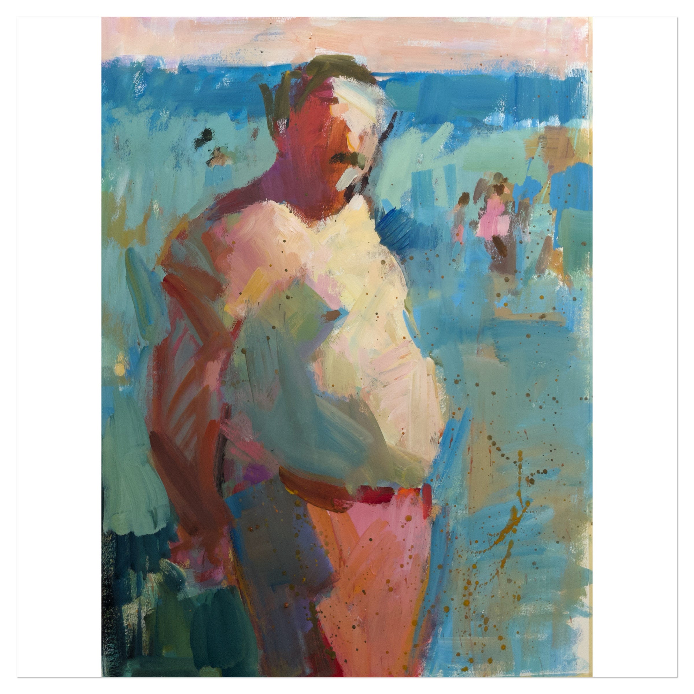
My most recent one is oil on primed muslin mounted on hardboard, a surface that’s new to me and which takes paint in a dry, broken way that’s interesting. It was all that I had in the studio at the time so I broke my cheap surface rule. And I was only day 4!
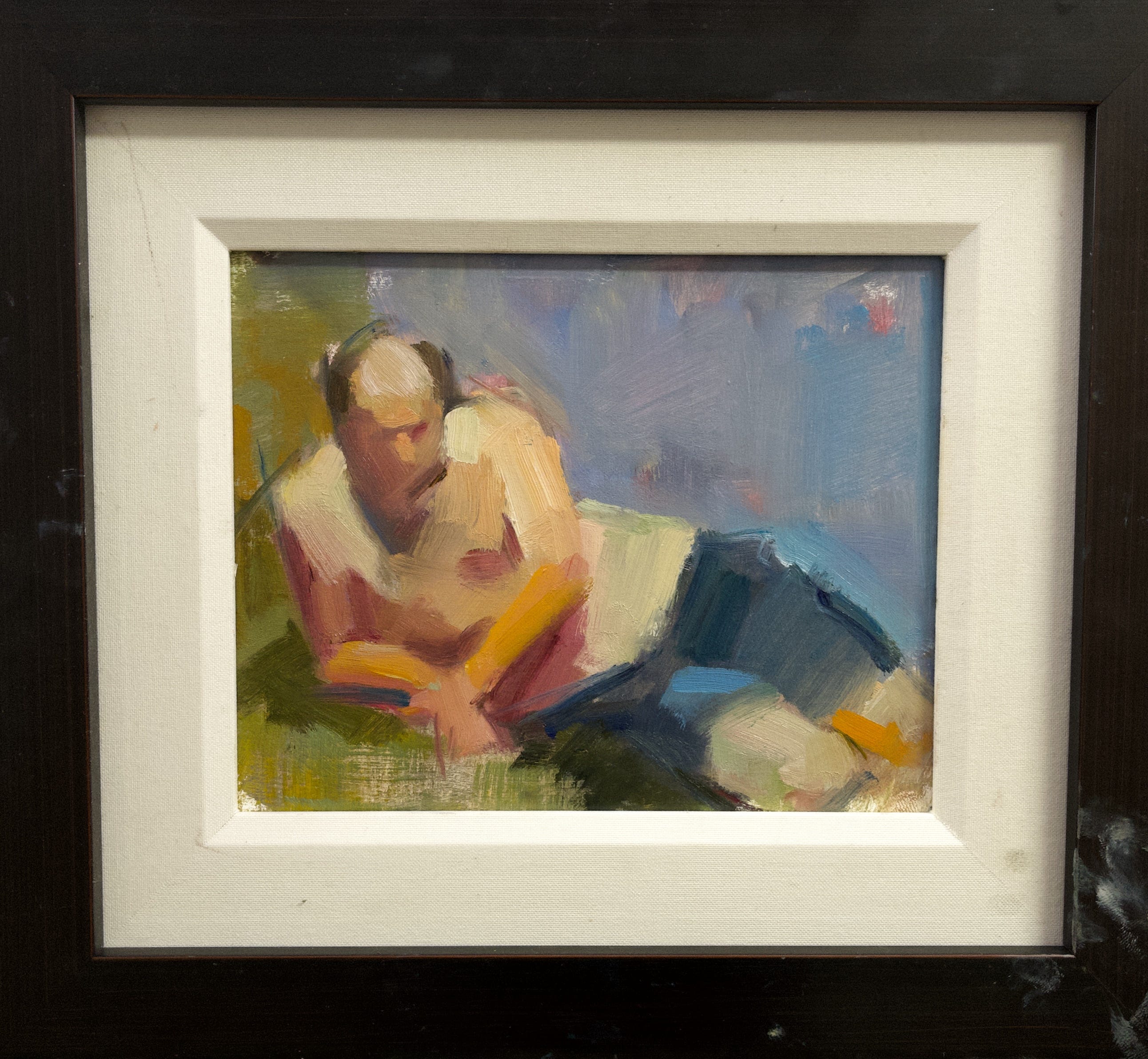
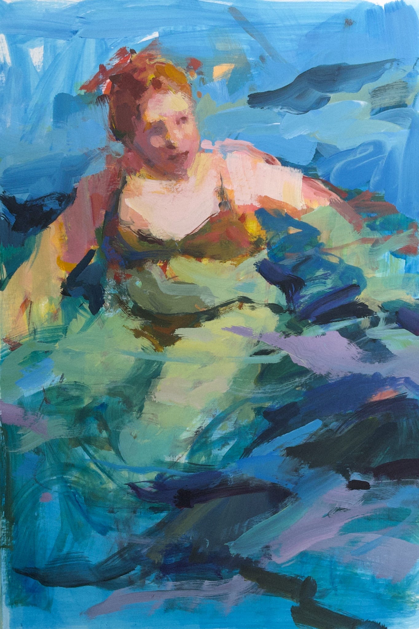
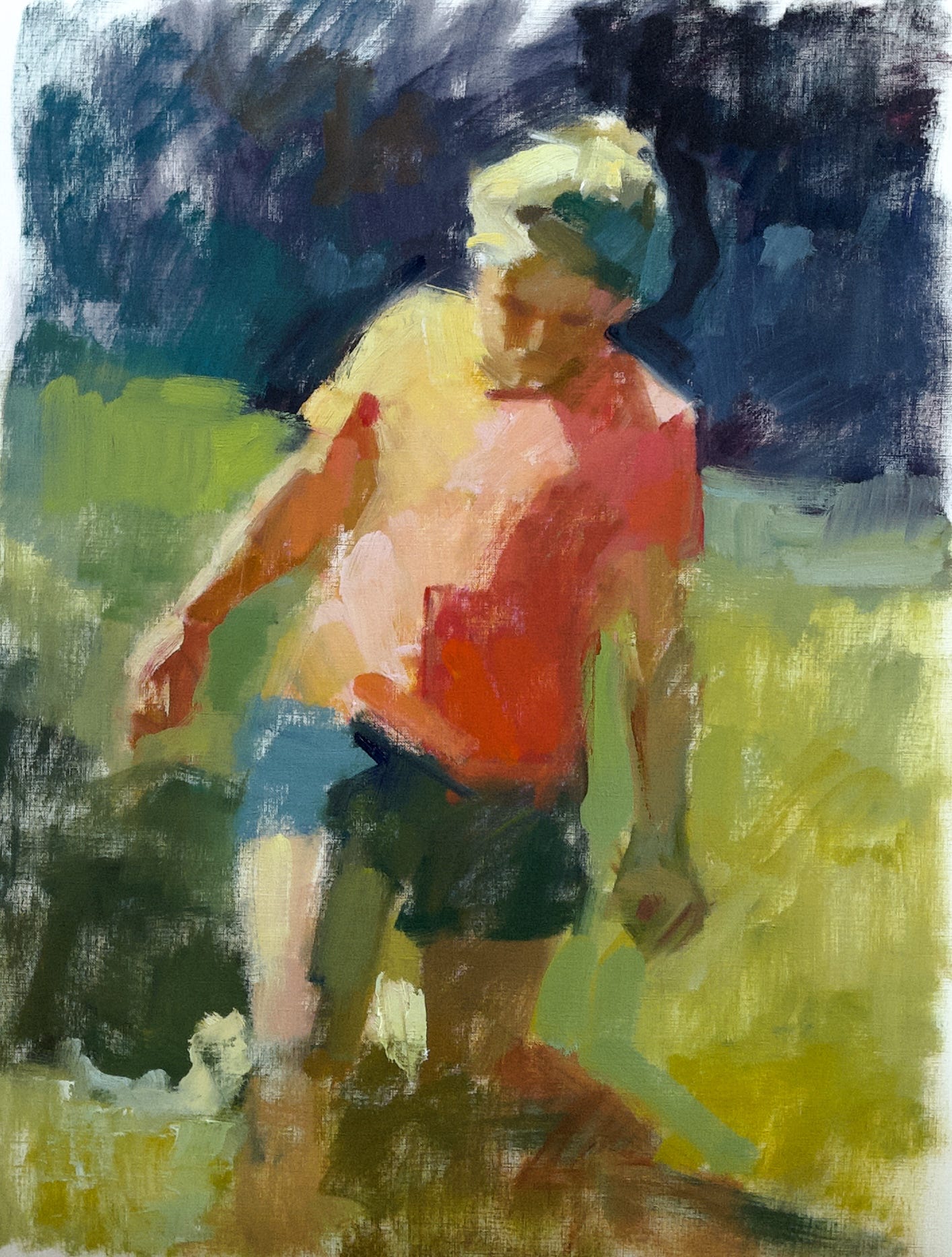
This last piece is my favourite so far. It hasn’t garnered nearly the views and likes on social media that the wading girl has, but the subject and the way it’s painted all hold my attention and give voice to my thoughts on colour, design, light, and feelings about aging and the human body. This figure is the nearest to a self portrait and he makes me very happy.
I’ve got ideas for how to push these little paintings to be much more expressive and representative of me and my aesthetic preferences and I’m looking forward to seeing how they evolve. I expect that the Jenny Nelson abstraction course is going to have a greater impact as I go because I’m still working my way through her exercises and learning a lot about myself as I do so.
It’s a rich time in the studio!
I’d love to hear which tree image you prefer and also which daily beach piece catches your attention.
If you want to check out my “Inspiring Art” board on Pinterest, here’s the link.
Happy painting!
Really loved your sharing. I have a few lists of inspiring art from Pinterest too, and I treat them the same way as you do. I would save tree number 5 and number 10 to my lists because they have the quality of depth I've been looking for in my practice. I have one question: you find no.4 speak to you the most, but I see the same quality of confident, bold brushwork in your works- maybe does it mean you like to move from representational to abstract completely?
I knew it. The big “light bulb” tree will live on in my brain! There is so much energy in it. Rich complex colours. Simplicity of shape. Similarly, I like the red-orange shirted wader
Ingrid, thank you for this terrific post