


The artist's business trip

I took myself on a business trip to Mexico last week to see a subject that I often paint in real life.
My favourite childhood memories are of the annual, sun and sea vacations that my family went on over Christmas breaks. Coming from a small, landlocked town in the mountains of British Columbia, we were awed each time by the fragrant, humid air that greeted us when we arrived in Hawaii, Florida, or California. And the light! I remember it dazzling us as if our Canadian sun were a different one from the one that shone on those beaches.
But memory only goes so far, and I felt the need to visit a tropical beach and do a proper study of the light and colours that I found there, so I spent a week pondering the vibrant colours of coastal Oaxaca, taking pictures and doing gouache studies.
It was time well spent.
I always tell my students that photos lie: distorting values and losing colours, and I saw that in a big way on the beach. My sensation was of warm, blazing light and inviting saturated colours, but the pictures that I took with my iPhone 13 showed an uninspiring view that didn’t invite painting. Being on the spot, though, I could take a picture then edit it in the phone while looking at the scene.
Here’s the original, lifeless photo and the edited version.
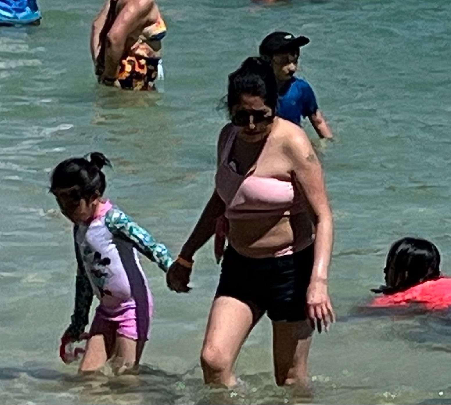
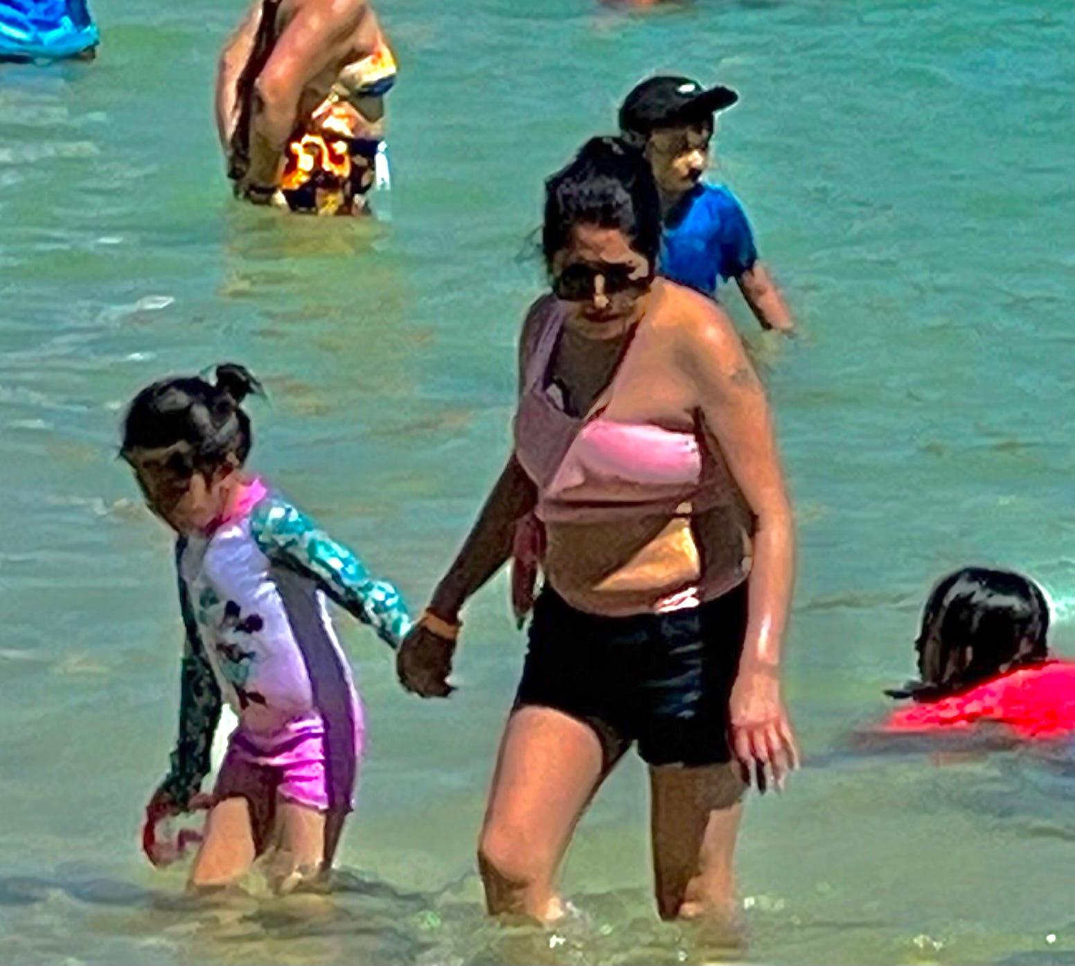
The edit is a much more paintable, enticing colour scene and it’s definitely more like what I saw. It was a sweltering day, the sky was intensely cerulean blue, the water sparkled in hues of turquoise and ochre-green, and all of the rich skin and bathing suit colours seemed amplified by the warmth of the sun.
To achieve this edit, I lightened the shadows by a dramatic 100%, darkened the highlights by 100%, decreased contrast by 25% and increased saturation by 23%.
It’s a good reminder to never trust a photo reference’s accuracy.
My gouache studies were difficult to make in the 33C heat because I couldn’t keep the piles of paint wet and ended up reconstituting them from skinned-over lumps with water (not ideal for colour saturation) but they still make useful references.
Again, I’m showing you significantly edited images of these paintings because they, too, suffered from too much contrast, excessive darks, blown-out lights, and not enough warmth thanks to the phone camera.
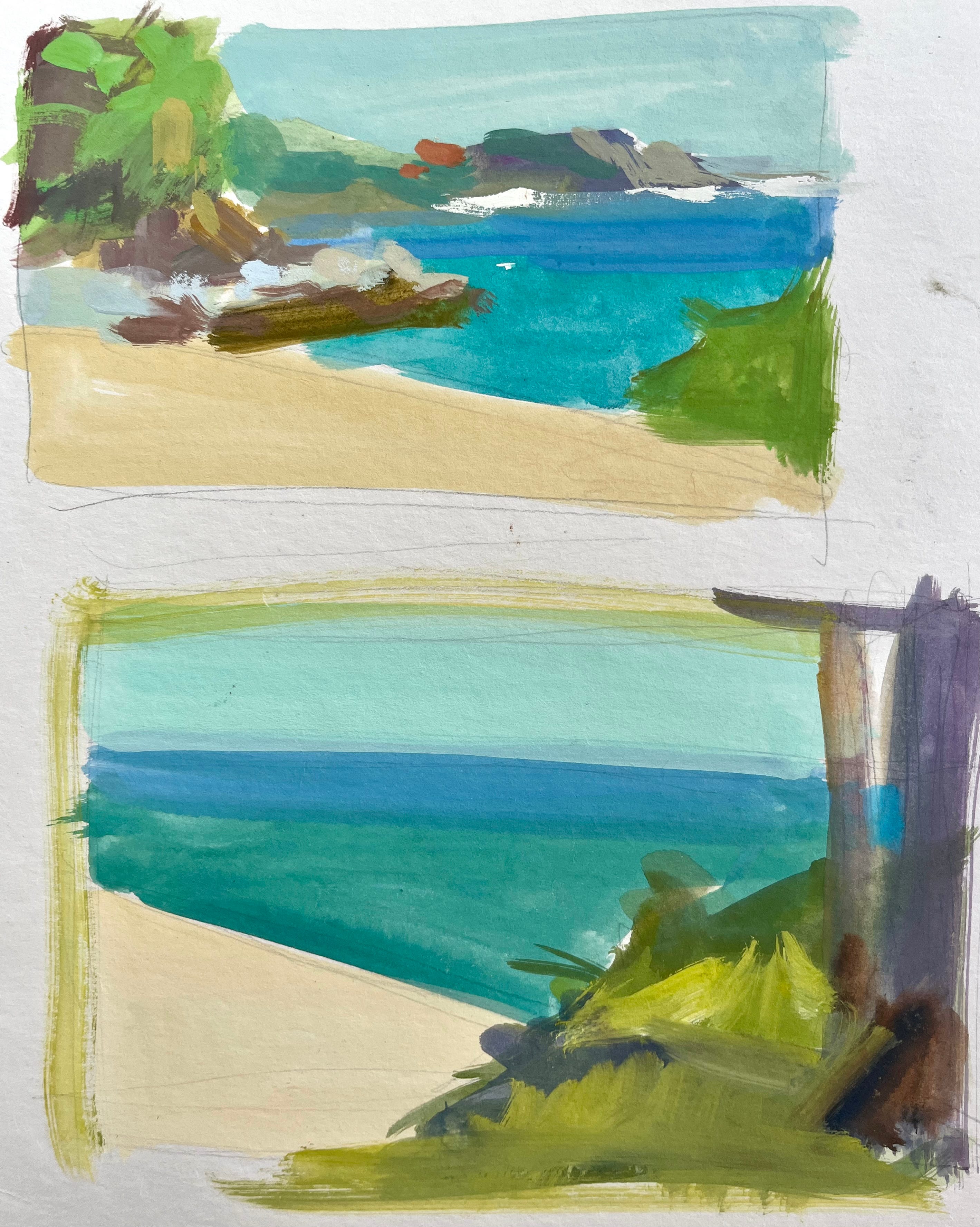
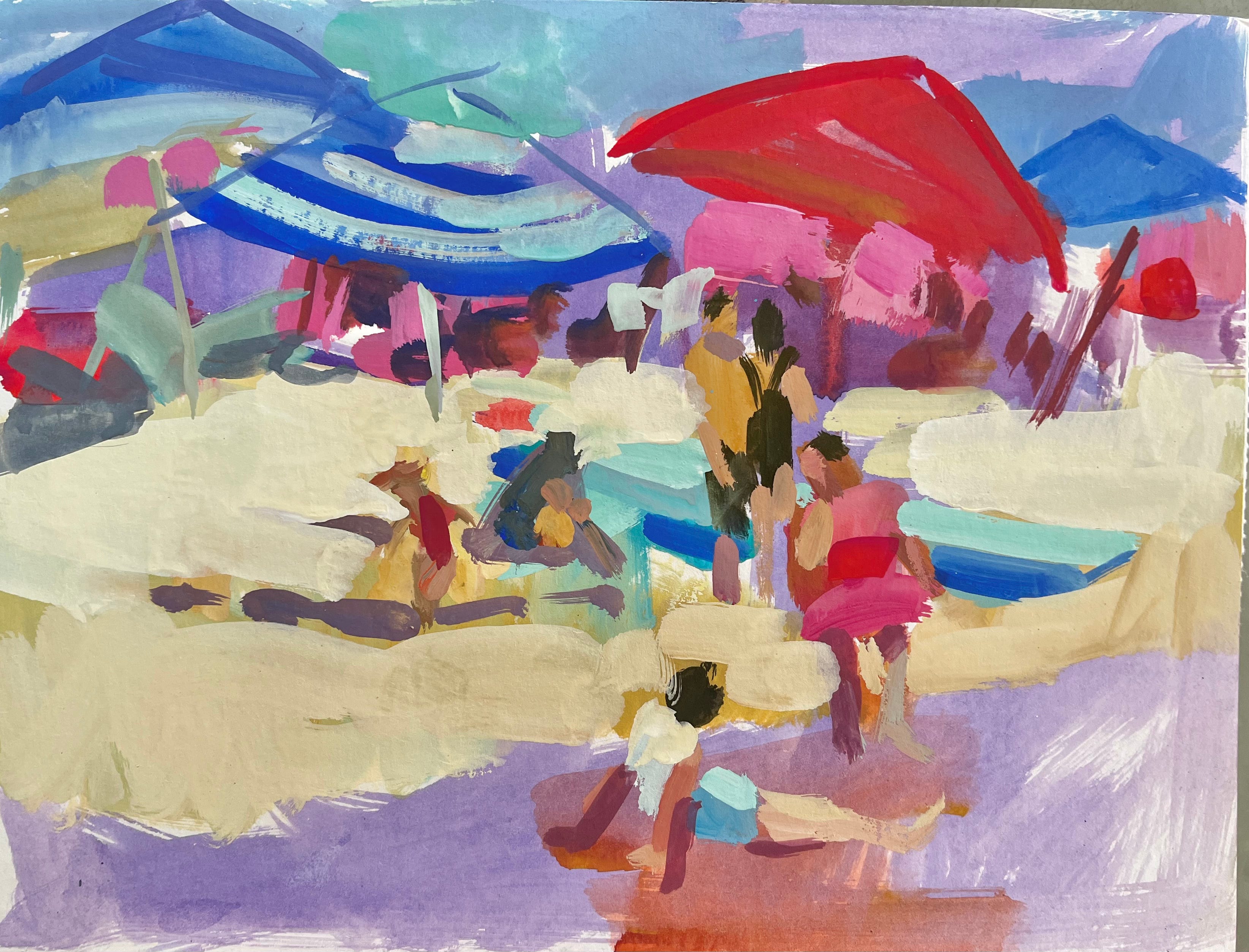
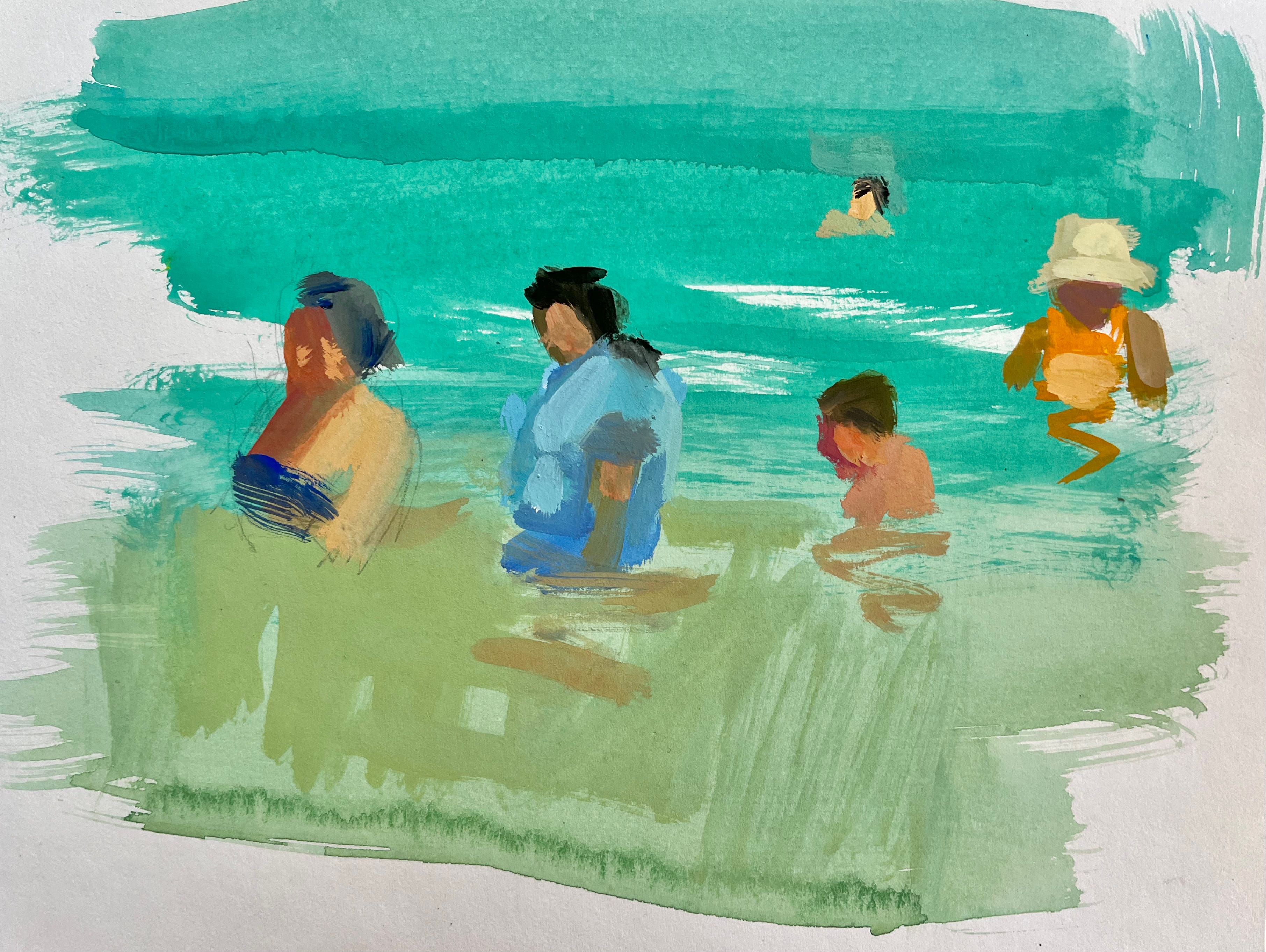
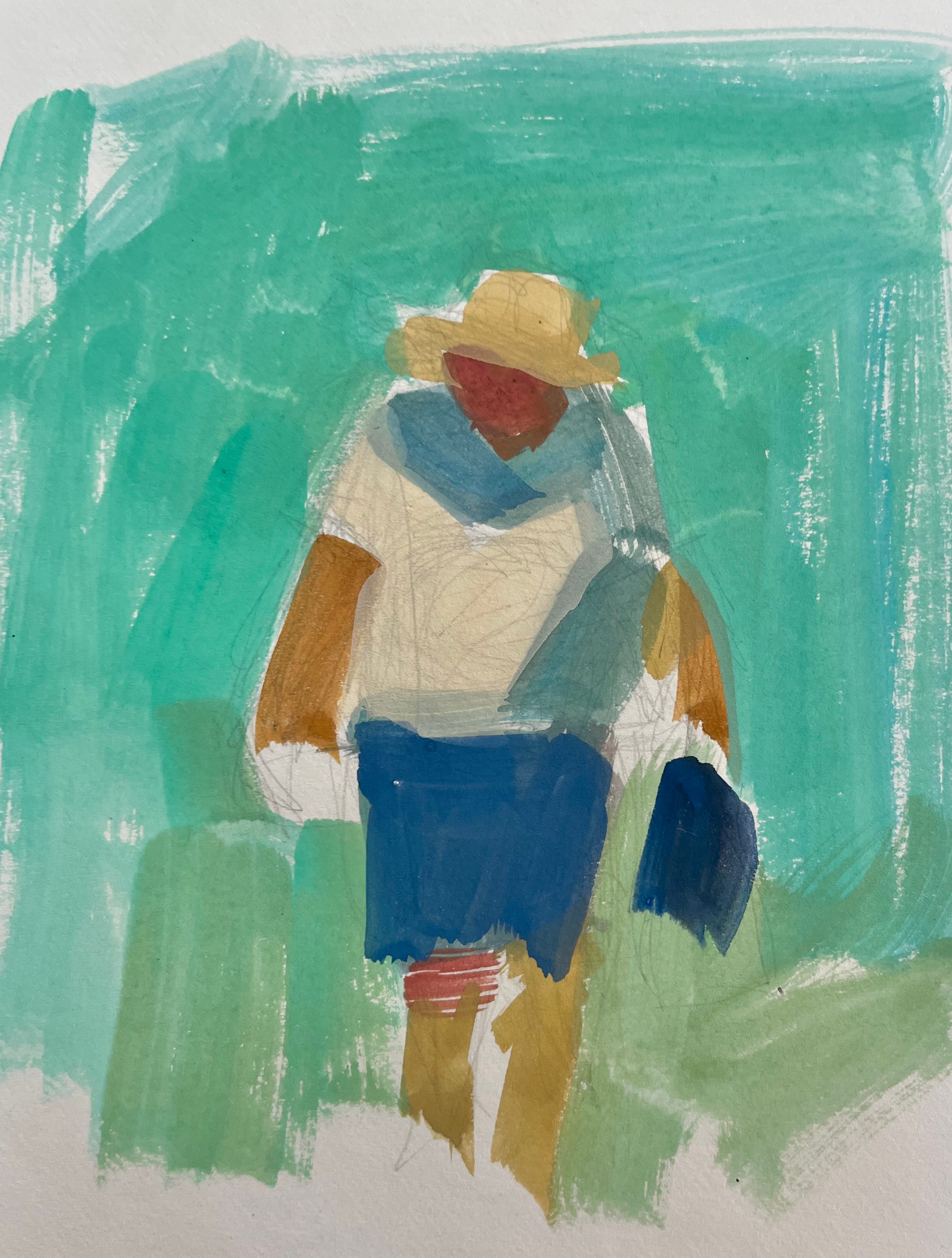
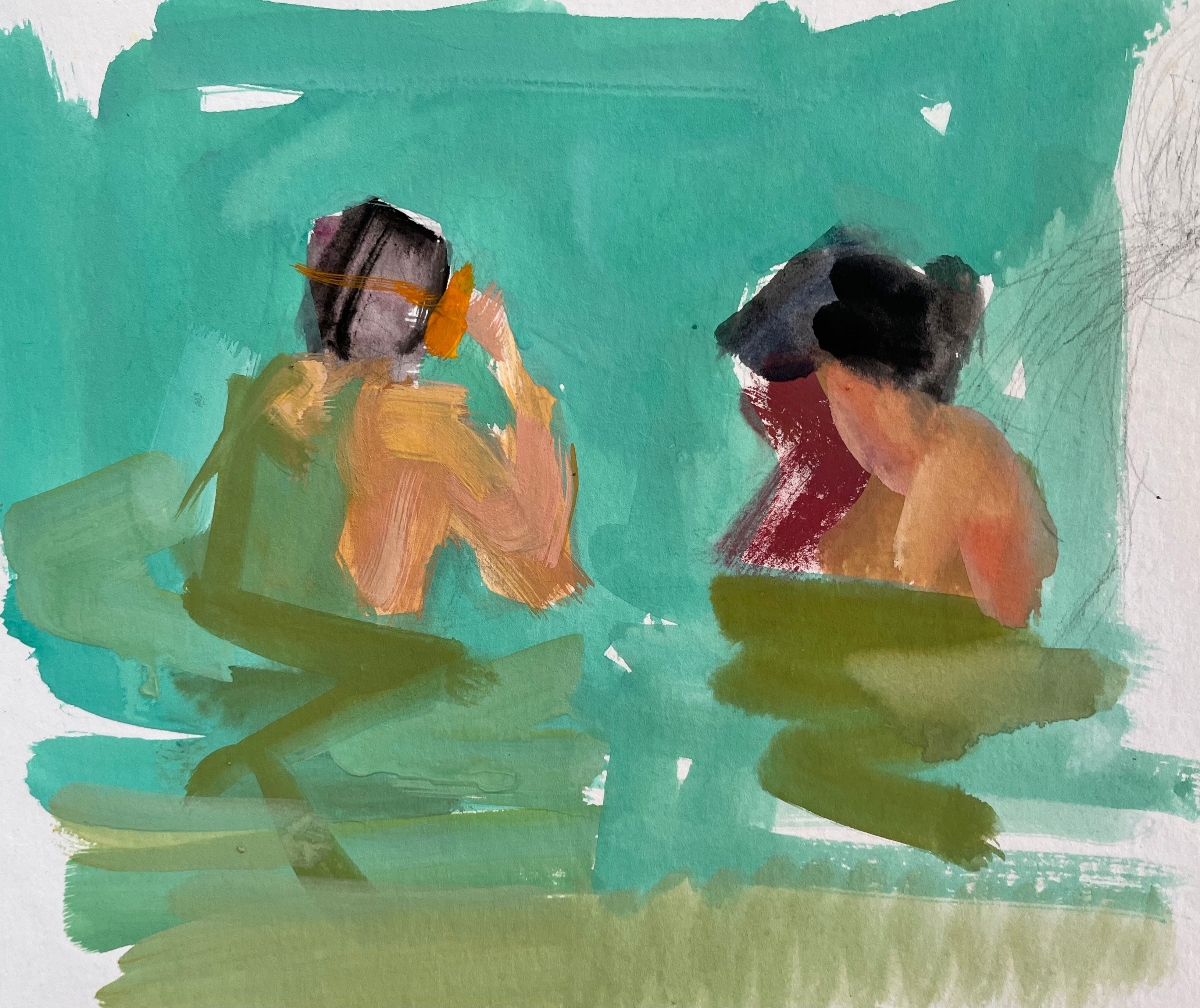
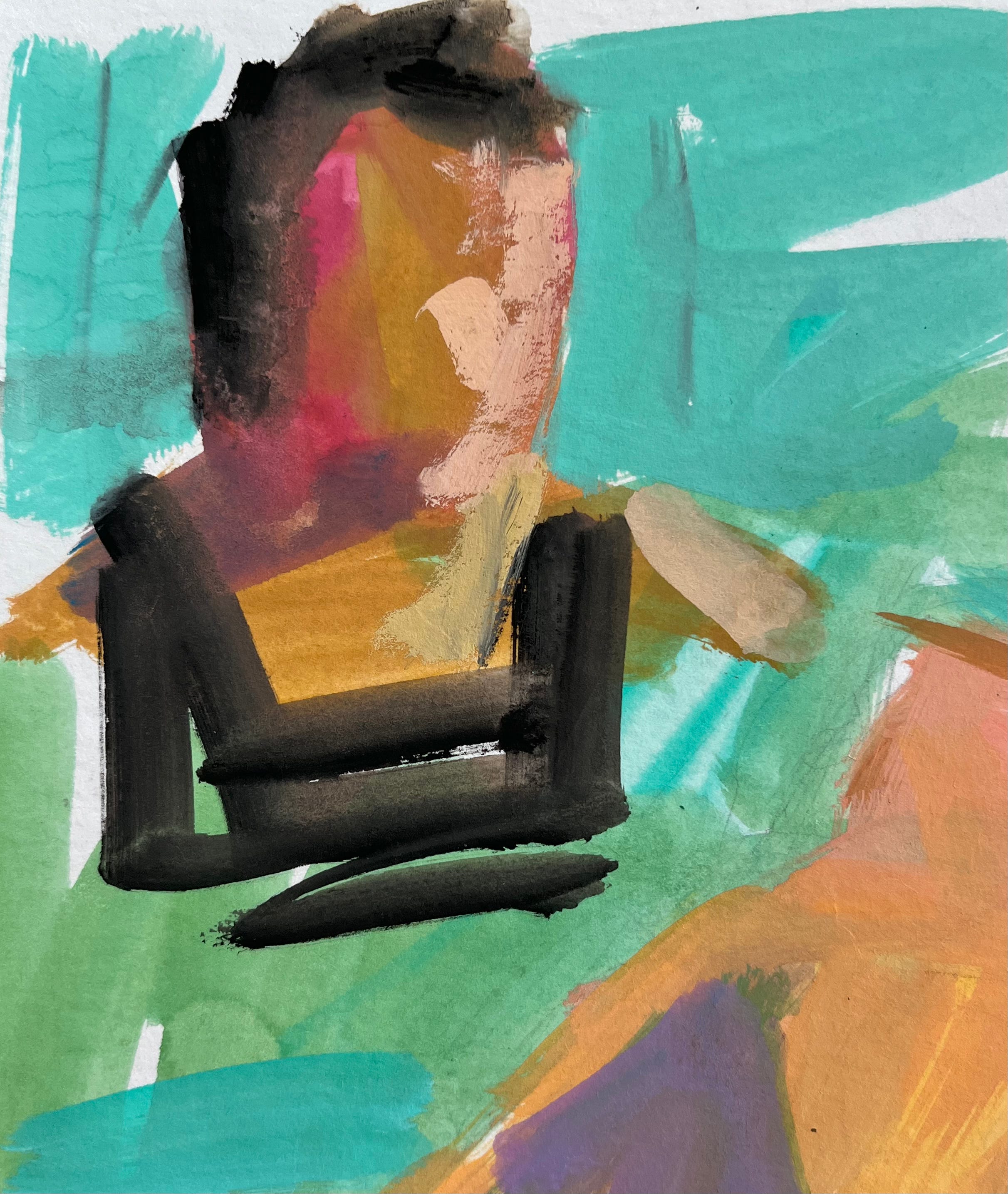
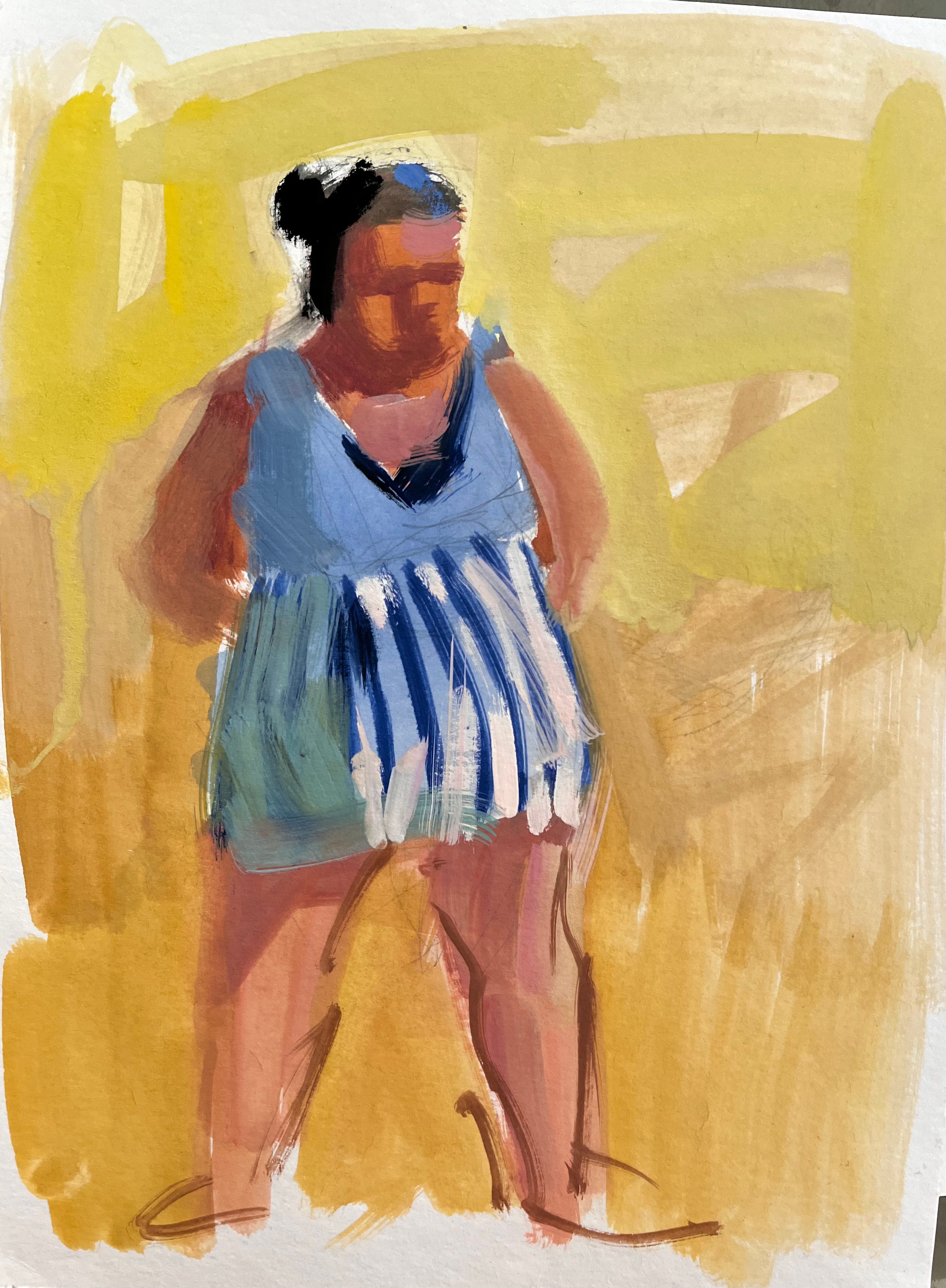
They’re rough and ready, but they remind me of the place. I’ll pin them up to my studio wall and refer to them often as I paint beaches over the winter.
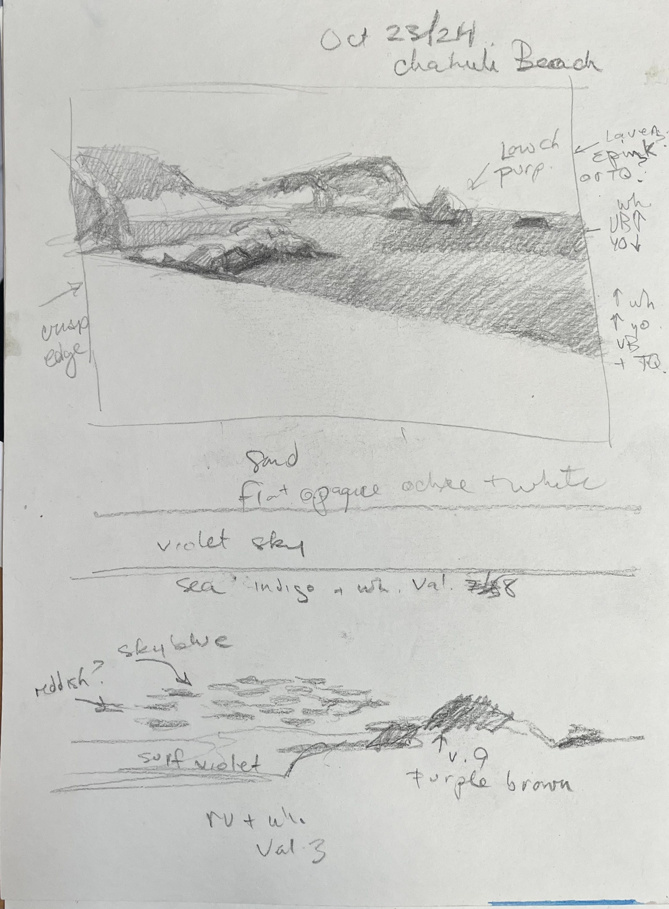
Along with colour studies, I did pencil sketches and annotated them with my thoughts about relative values, possible pigment mixtures, and even some edge notes.
All in all, it was an incredibly valuable week of research. And - bonus - I got to eat fantastic food and swim in the sea:)
I’m back to the reality of autumn in Canada but I’ll be painting the beach with greater confidence this winter.
I’ll also be teaching workshops online in a couple of weeks and there are still spaces in my composition course. I’ve got dynamic exercises planned to help students improve this fundamental aspect of picture making, and I hope you’ll join me!
Happy painting!
Thank you! I am glad you had fun and admire you so much for never stopping to learn and share your valuable experiences and knowledge.