

Process shots of "Vacation"


I always enjoy seeing artists’ process shots so I thought I’d take a few of my own for this piece. “Vacation” is an old, family photo interpreted in oil on Russian birch panel.
Starting on high chroma colour is not something I often do, but it seemed right for the subject. Beach toys are always brightly coloured and a day at a tropical beach is forever paired with that level of saturated colour in my memory.
These photos are taken with an Iphone and are, as a result, overly contrasty and saturated, but they still show the development of the painting, revisions and all.
I started by placing little colour notes on all of the figures and by knocking in the general colours of the environment. Getting the water, sand and sky in early gives me something to relate all of my other colour choices to in terms of value and saturation. I can also repeat these colours in the figures, enmeshing them into their environment rather than having them look Photoshopped into the scene and unrelated to it.
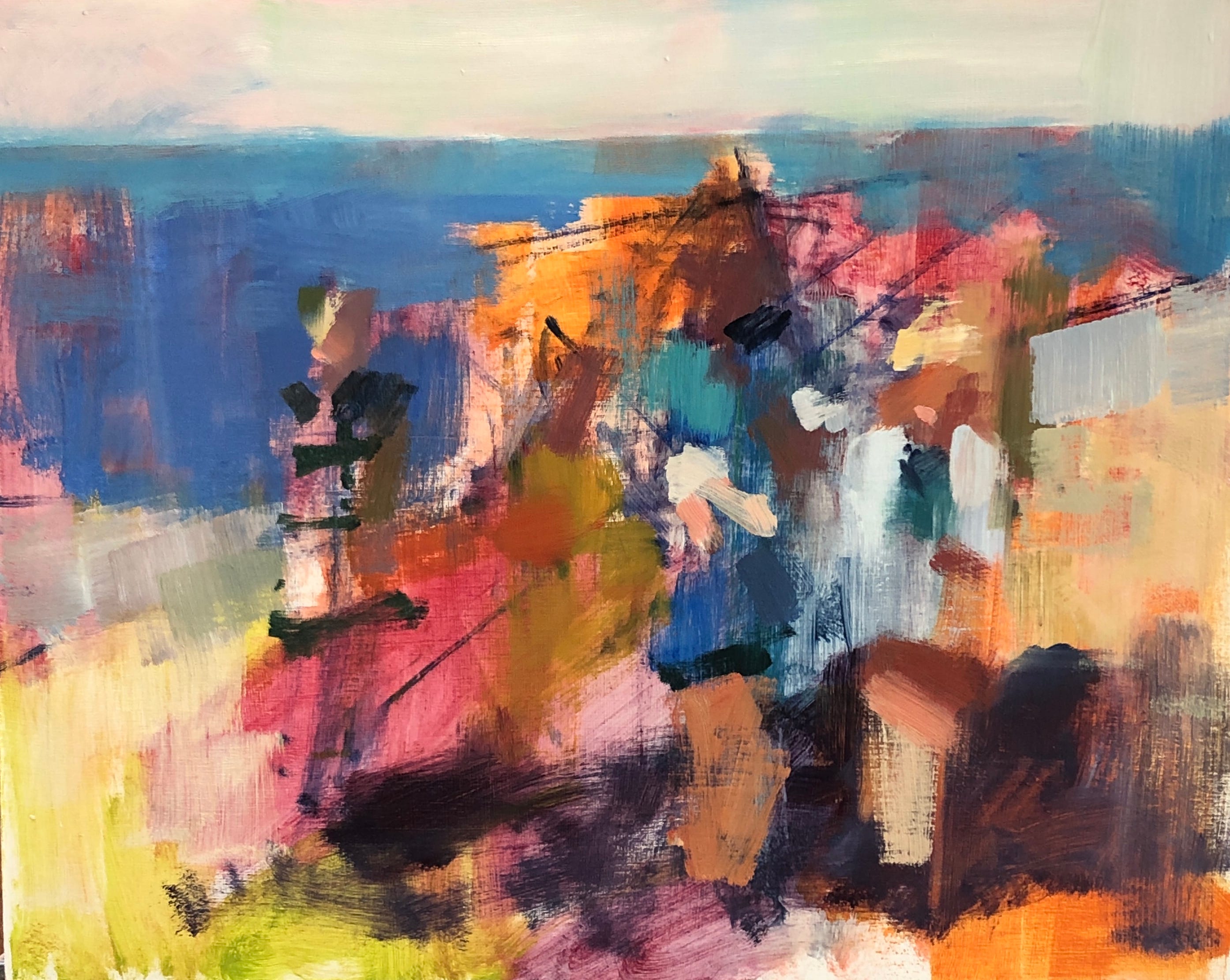
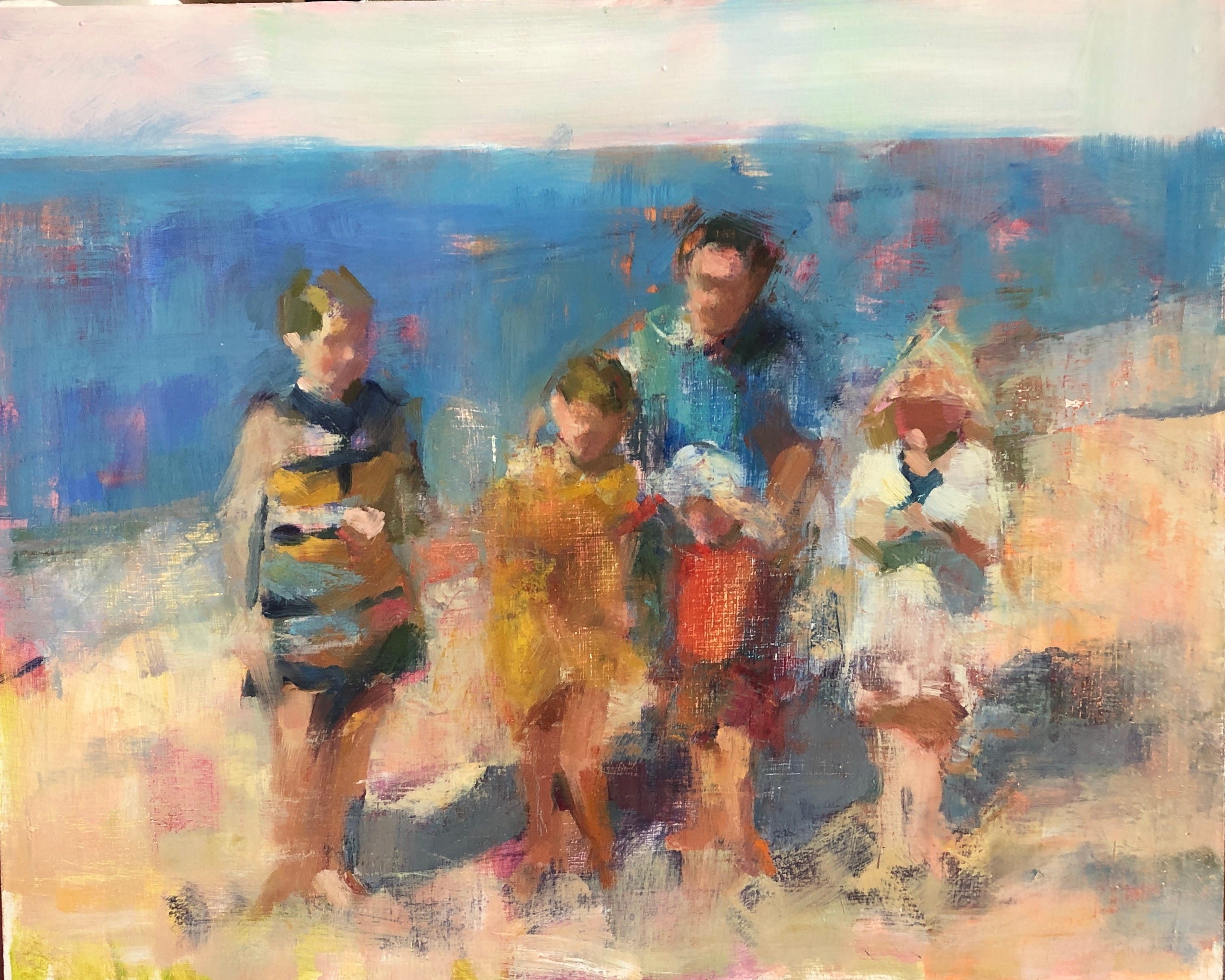
The image below has a lot of information - though it may not seem that way. I’ve determined the figures’ relative heights and major colours of the clothing. As well, I’ve placed some of the lightest and the darkest colours. Next, I start bringing each figure into focus, one at a time.

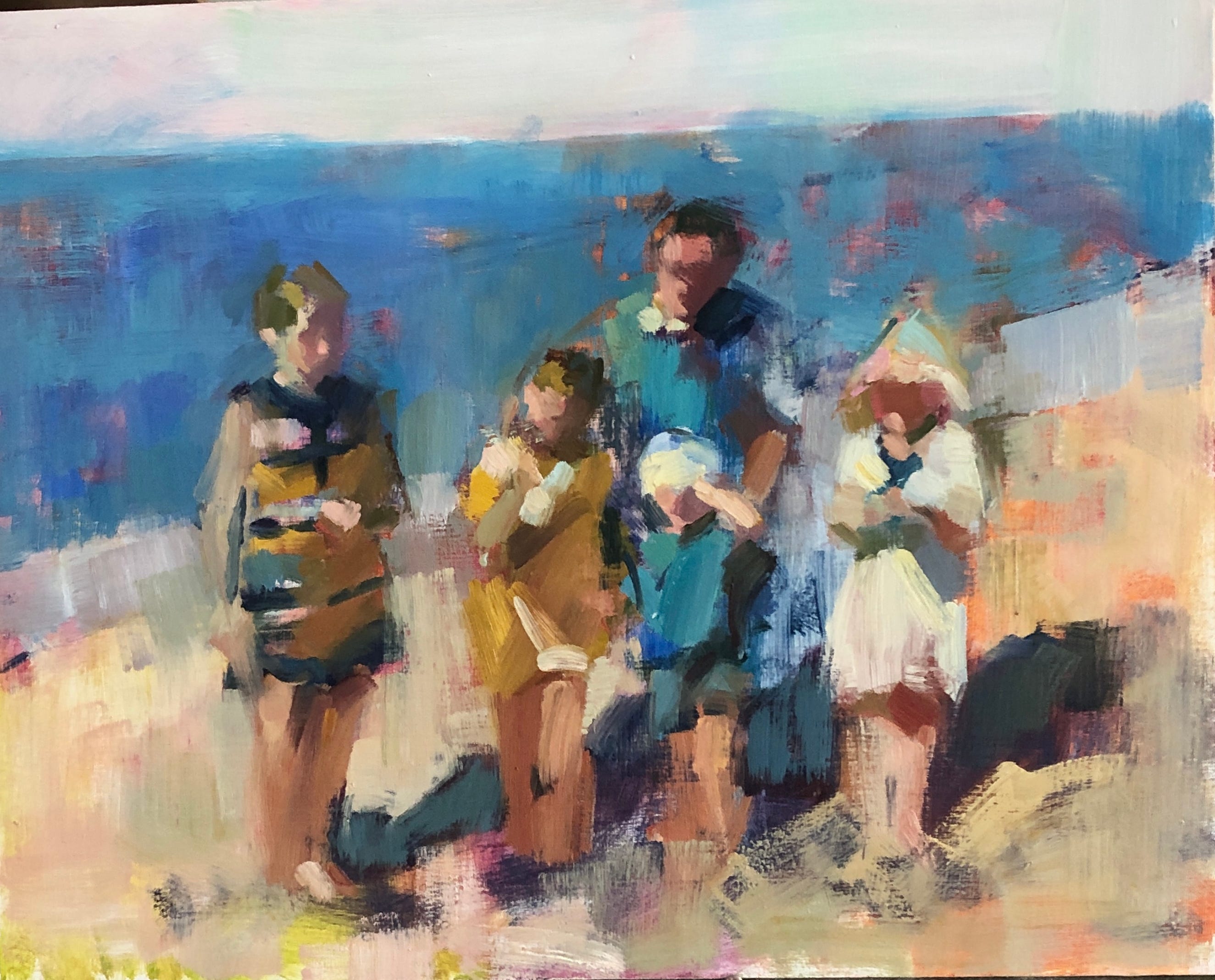
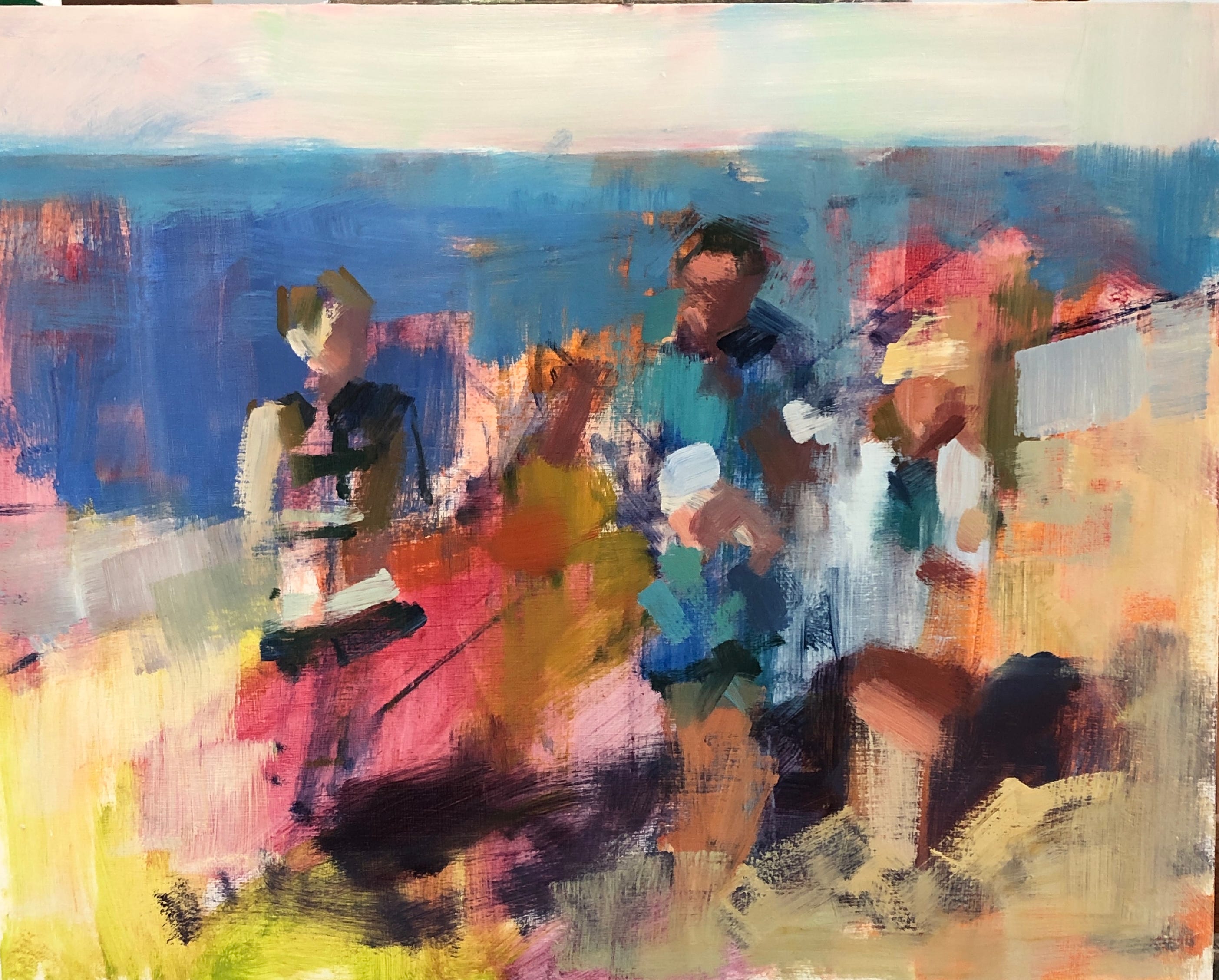
Below, I changed direction with the little boy’s outfit. In the photo, it matched his father’s, but I found myself struggling to separate the child from his parent. I gave him a scrape and tested the effect of red. And, for a while, it seemed like that would work.
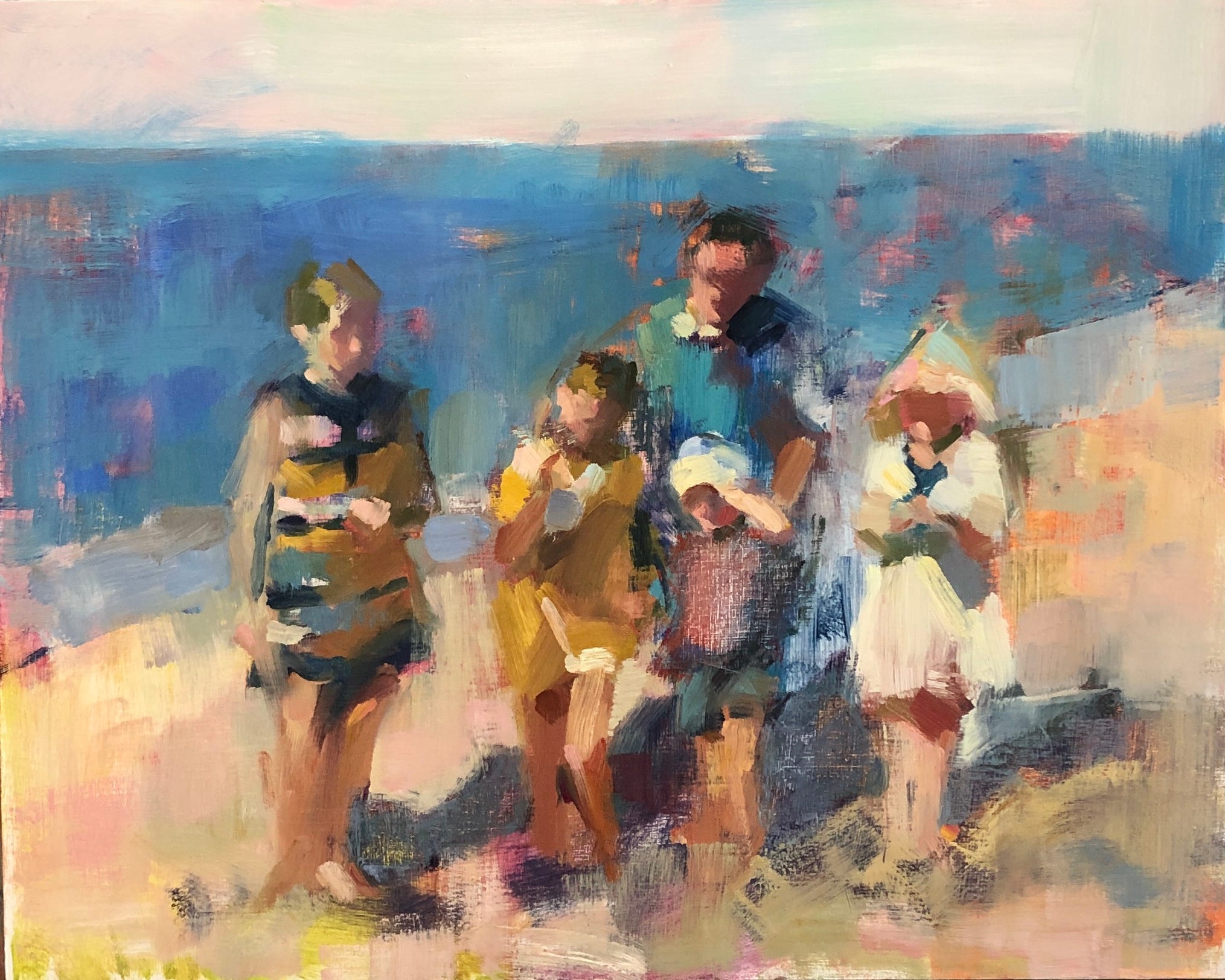
But then I felt that the dreamy harmony of the scene was being lost with this jarring note of colour. What I enjoyed about the photo was how few colours there were in the clothing. Blue, mustard and white wove through the figures in different proportions creating interest and unity. That red crashed into my eyes and created a whole different flavour, one of contrast and high energy. It had to go.
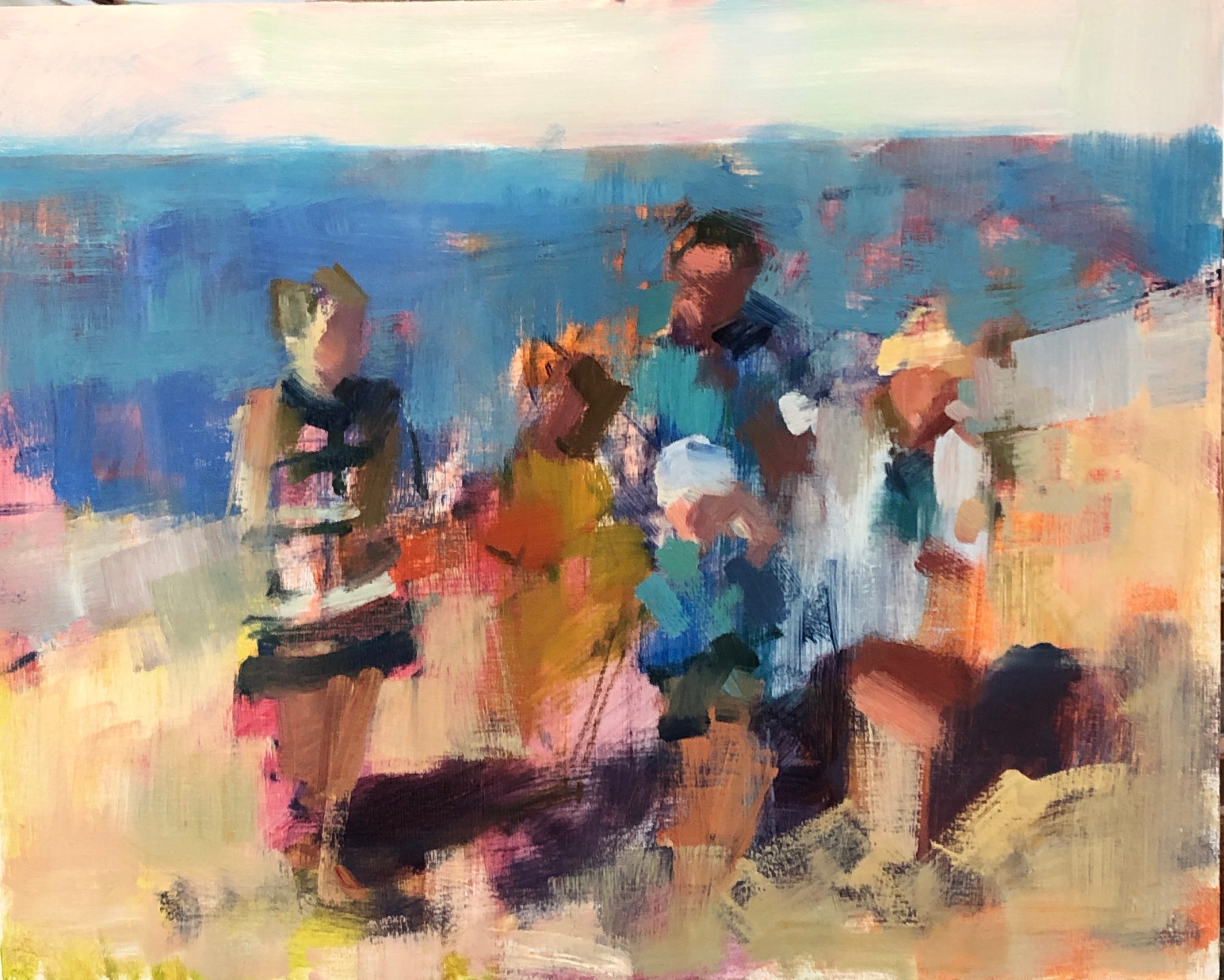
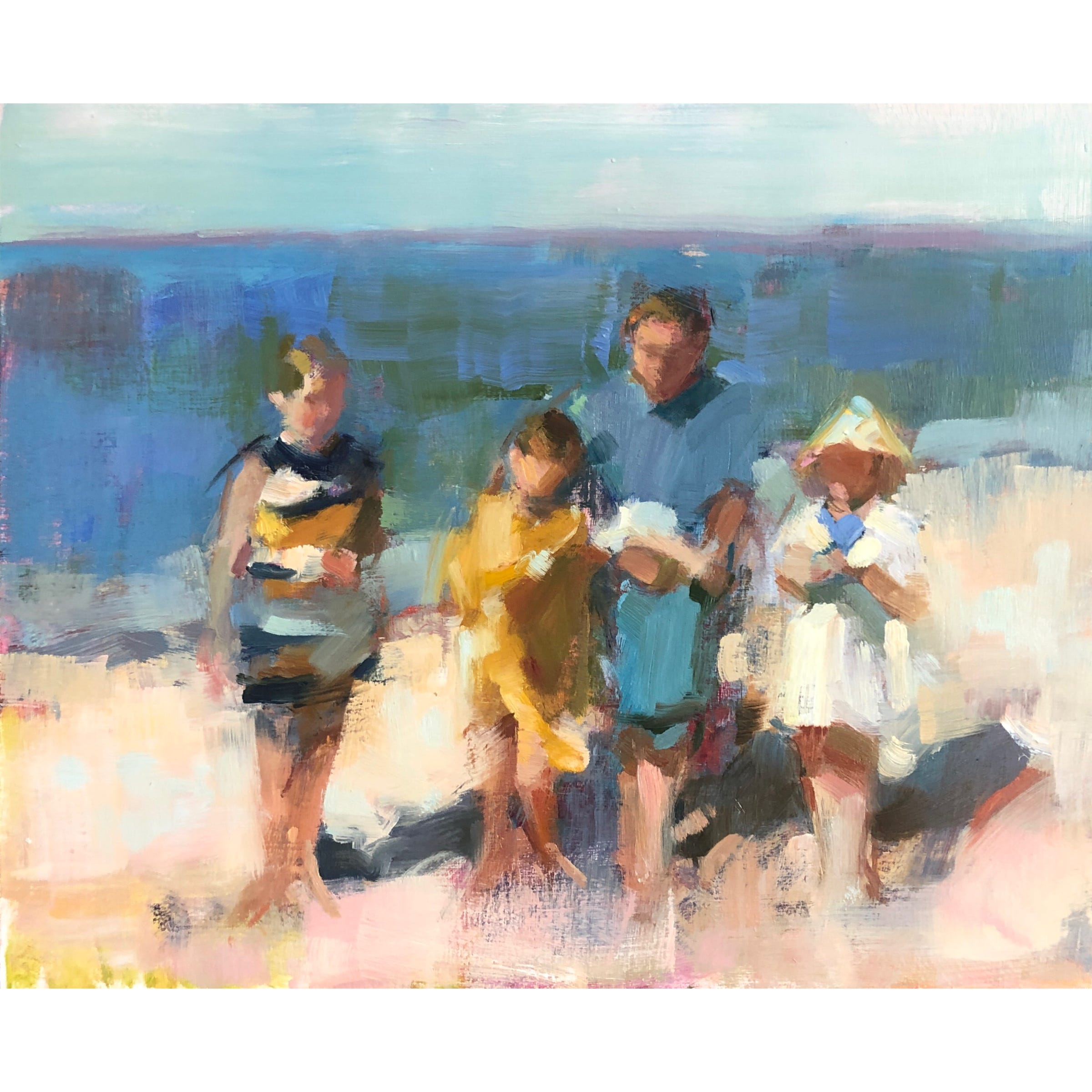
Again with the scraping. While I was at it, I knocked down anything that felt too fussy and obvious. You can see that it was a lot! Mostly, I was noticing that my eye wasn’t moving easily through the figures. I was getting stuck on dress stripes, small patches of light and annoying little marks in the sand. All of these were beside the point. I was trying to show a memory and memories aren’t filled with details, they’re broad strokes. I remember pale, glowing sand as a large, simple thing. I don’t remember it filled with the reality of footprints and small shifts in value. The same was true of the figures. I’d gotten too caught up in the photo’s information overload and begun putting patterns on everybody. The striped dress was really the only clothing that interested me and so was the only element that didn’t get hugely simplified and edited. I think you should always honour your interests by painting them otherwise you deny yourself pleasure.
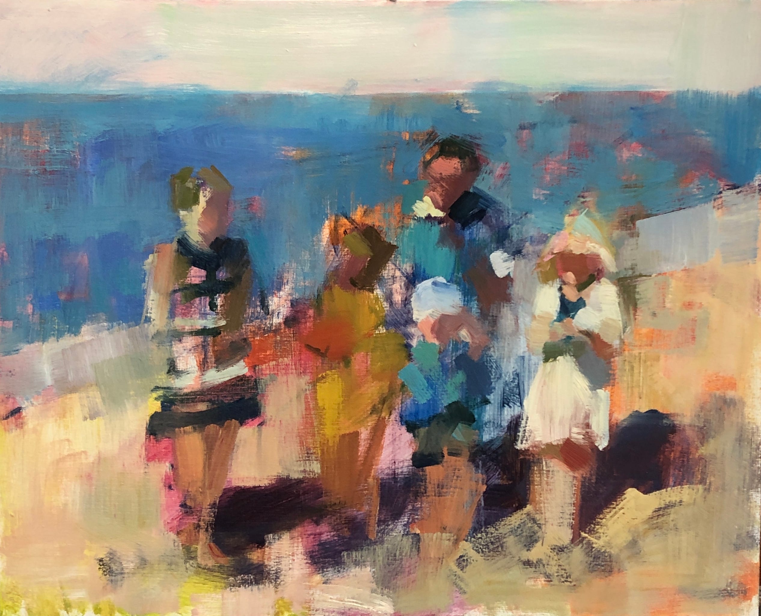
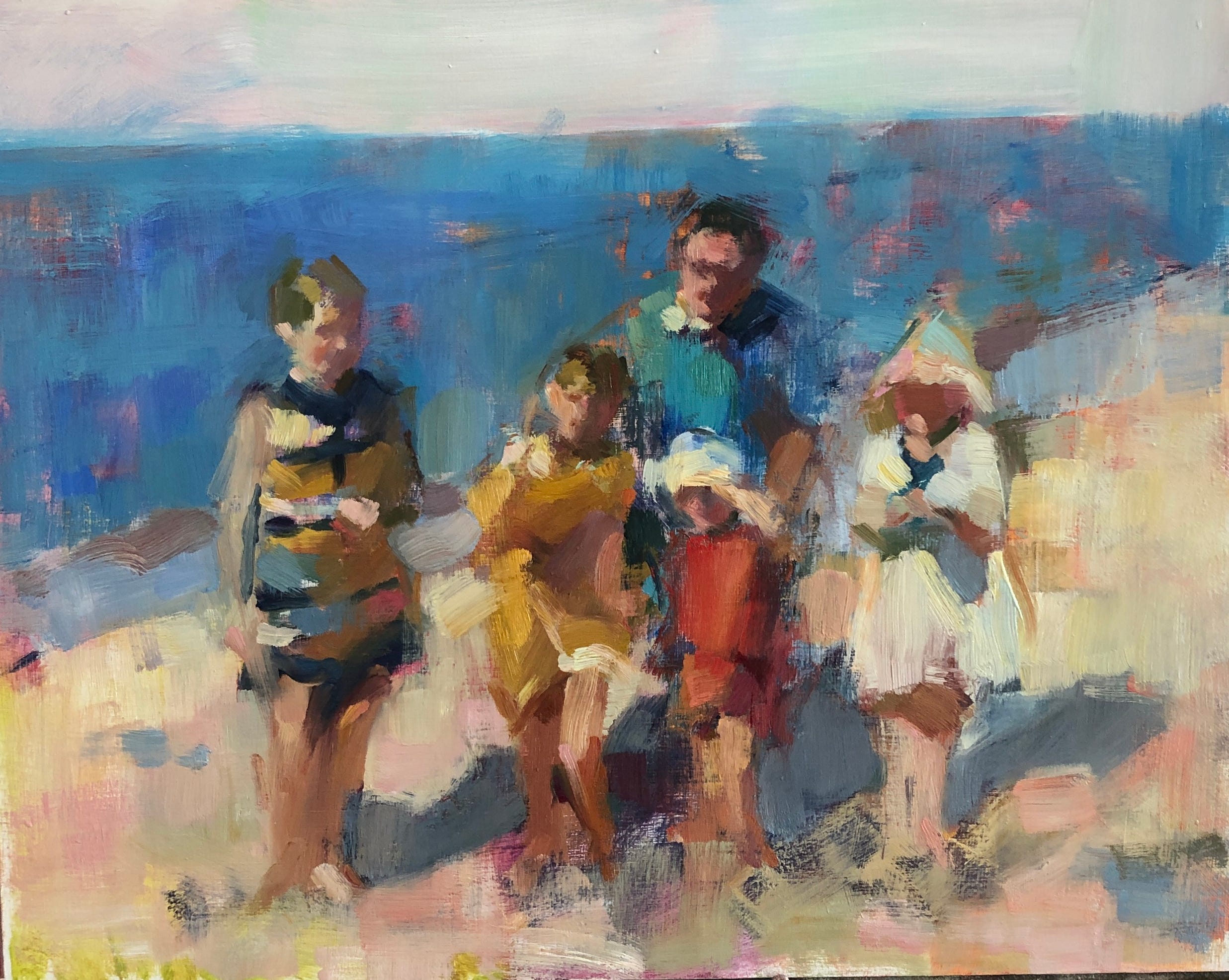
Below, you can see that the youngest got his blue outfit back. I changed the hues between father and son to separate them but I really like the coherence of that tall column of blue flanked by the other, smaller patches of colour. White notes are more intelligently placed now. They dance across the figures, extending to the edges of the sand and melding them into their space.
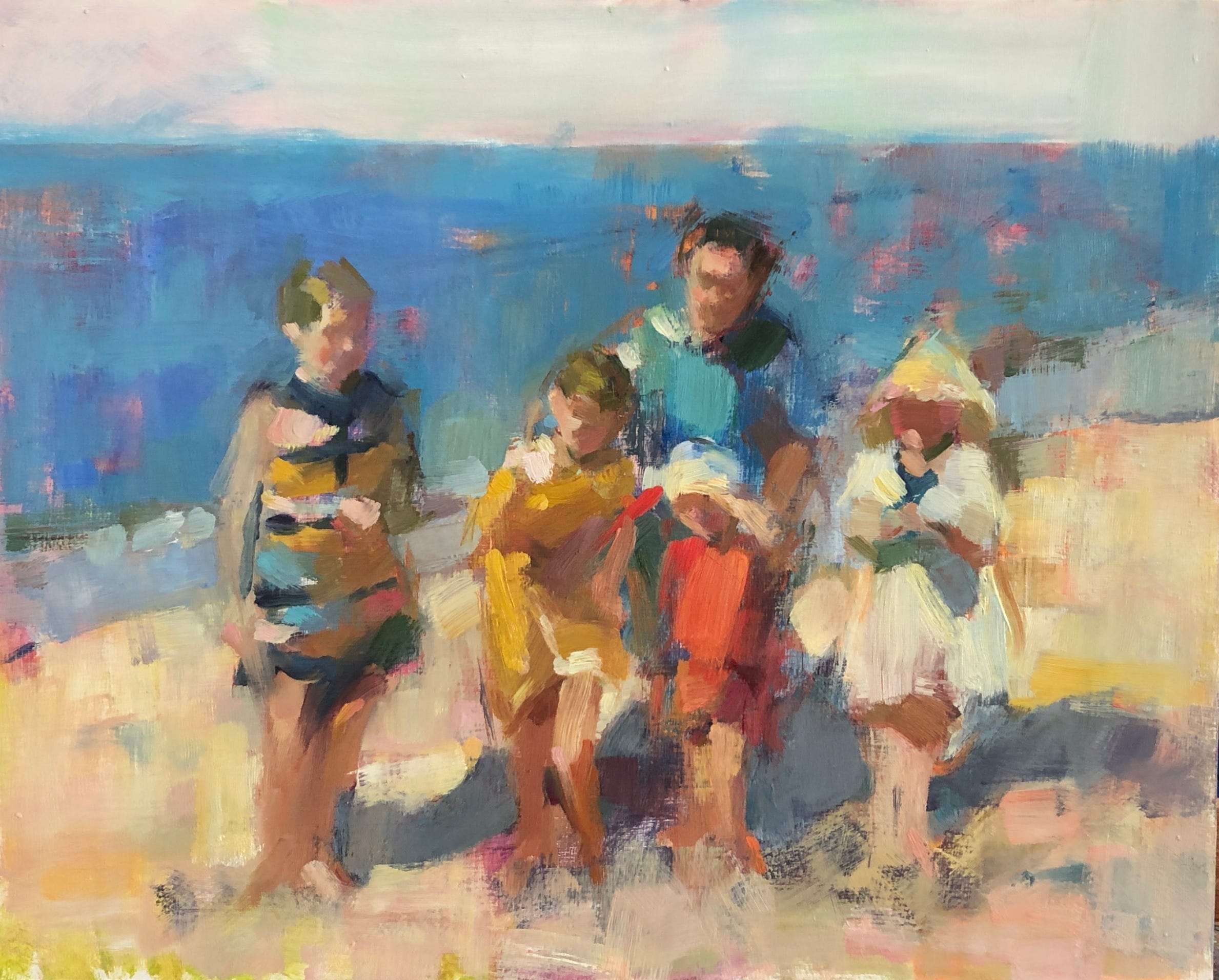
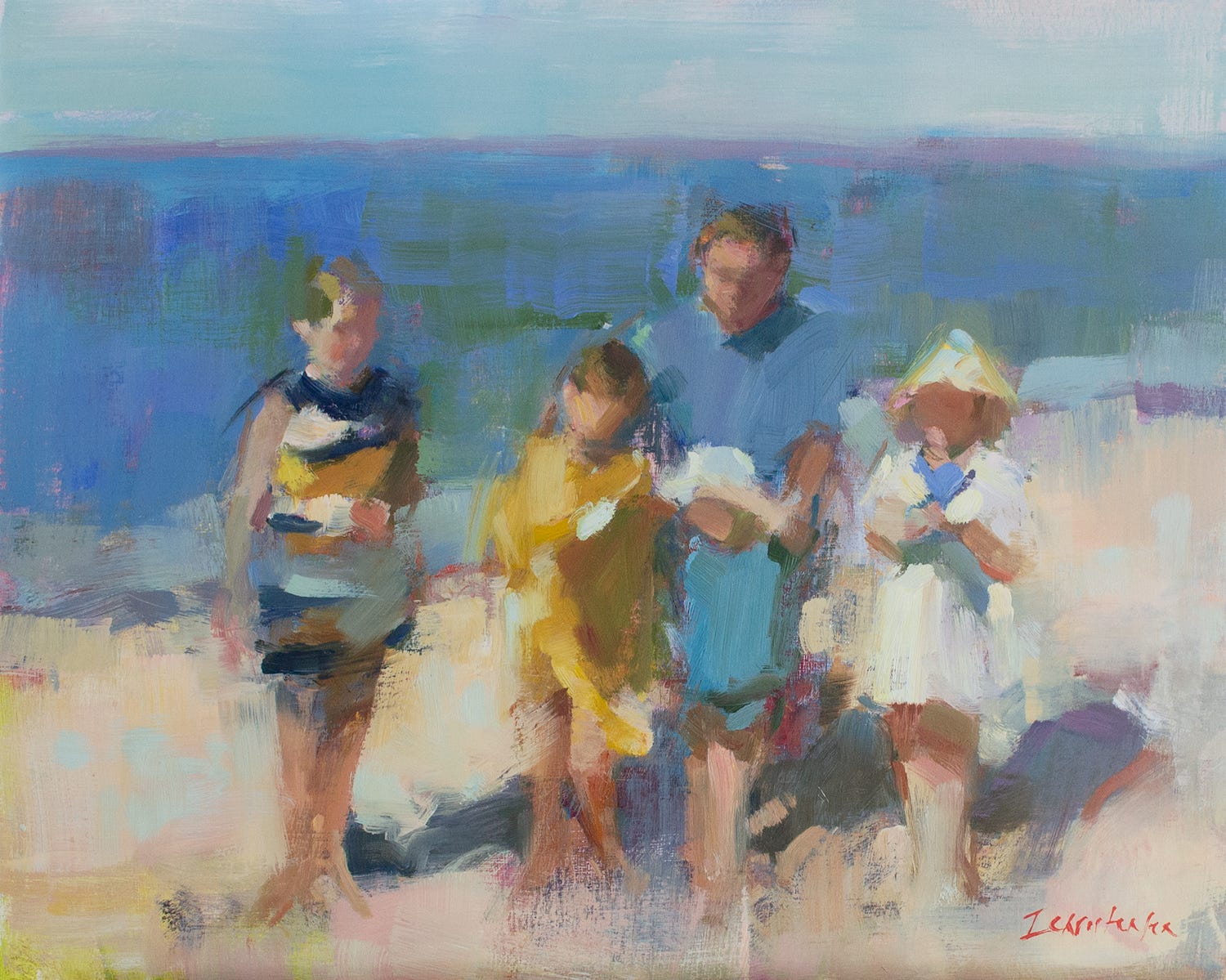
Below is the final version, taken with my DSLR Nikon and colour corrected. It’s never the same as seeing a painting in life - especially one with so many layers, but it’s far less garish and wrong than the cell phone shots. Fill the screen with it, and I hope you’ll get a sense of the dreaminess of that day when a mother took a picture of her family on the beach and everything was right with their world.
Happy painting!
Lovely painting. Thank you for sharing your process. It is wonderful to experience the evolution of your painting. I'm looking forward to attending your next painting class..