

Masterworks of colour, London

I’ve been home long enough to have recovered from jet lag (I’m a champion at long jet lag) and the amazing art that I saw has begun to fade from my brain. Before it’s all too distant to talk about, I’ll post more works that I admired for their technical prowess. There were hundreds, so I’ll focus on colour usage for this post.
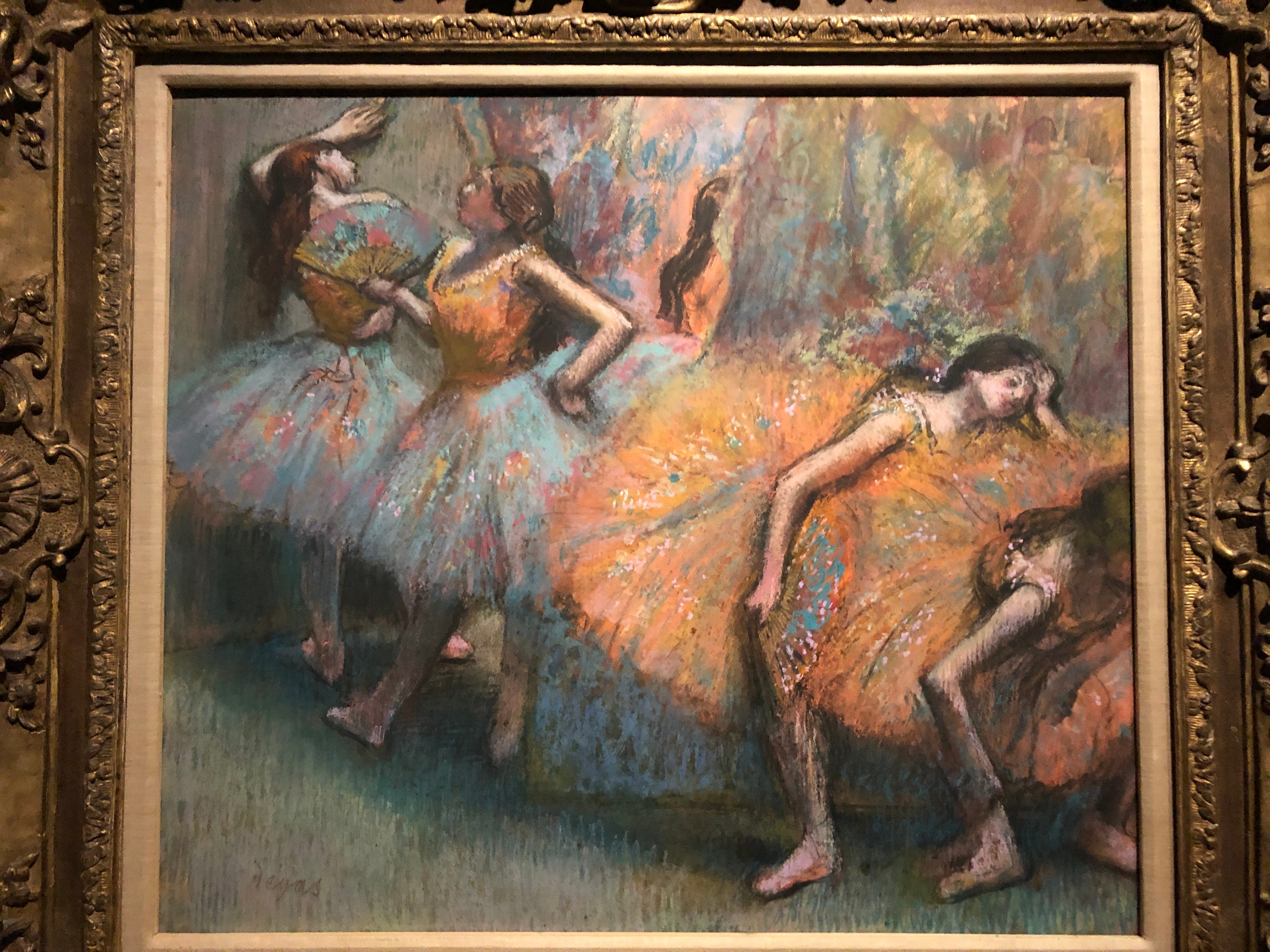
I’ve been talking about colour schemes in my “Painted History” online workshop at the Winslow Art Center and this Degas is a great example. He used a blue/orange complementary scheme which makes his colours vibrate. As well, using blue on the left helps to push those figures further back in space. He wove orange into the blue tutus and blue into the orange which unifies the colour composition and moves the viewers’ eyes as we follow these flashes of colour through the space. Degas never disappoints.
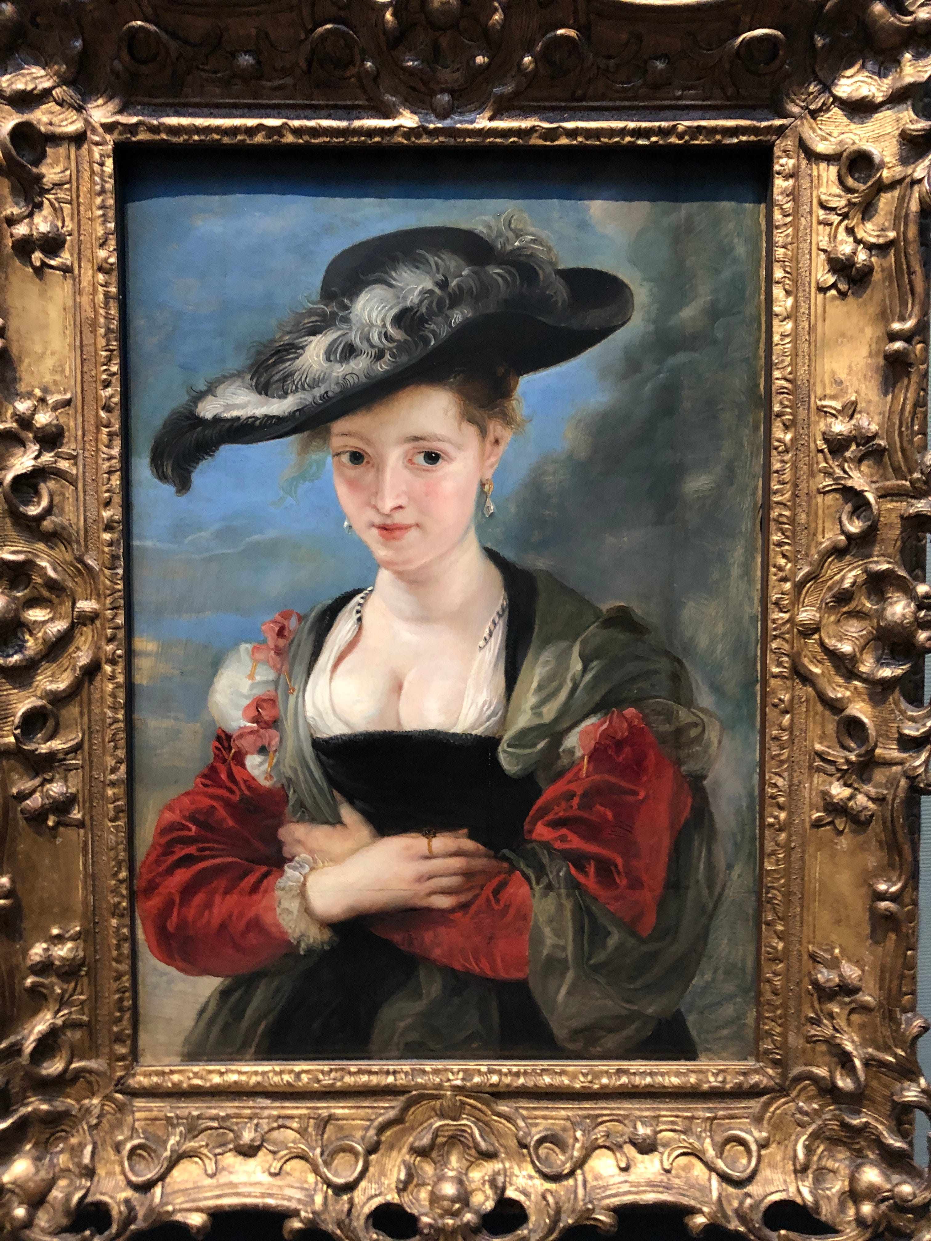
Rubens used the same push/pull relationship of blue and orange in this glowing portrait but, instead of moving they eye with colour, he used value. The black that encircles the figure lead us around the canvas. Colour plays a supporting role.
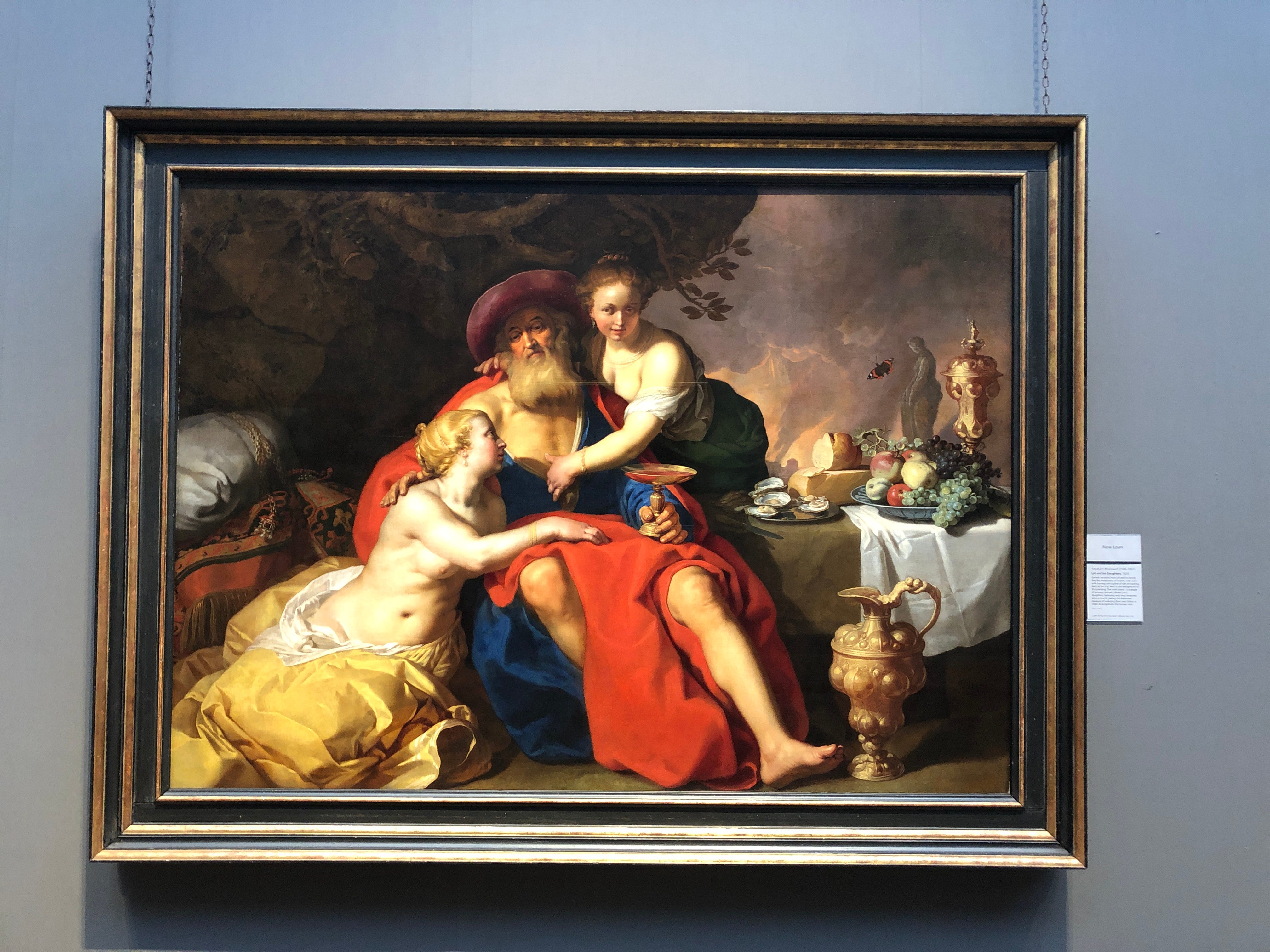
Abraham Bloemaert’s sensual painting of Lot and his daughters is racy and noteworthy in many ways, but, as a painter, I tend to ignore the subject and focus on the paint. Have a look at how he made us look at the still life on the table by moving red in the form of a butterfly and a red apple. Yes: symbolism aplenty - but check out that tight colour composition!
Follow reds and blues through this incredible Fra Angelico altarpiece. Gold leaf harmonizes the whole thing but colour moves us from one tiny face to the next.
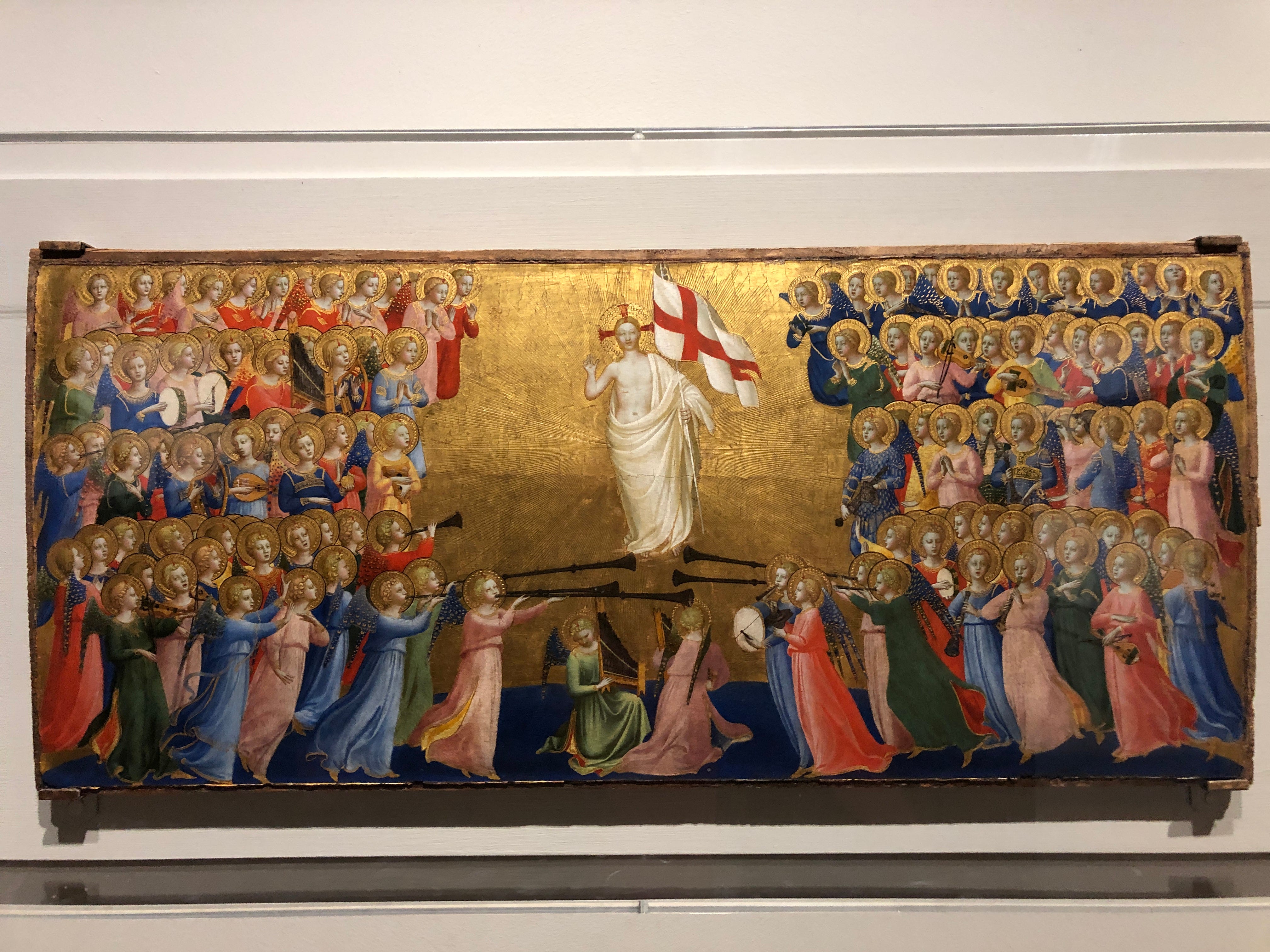
And who knew that bucket hats were a Renaissance thing?

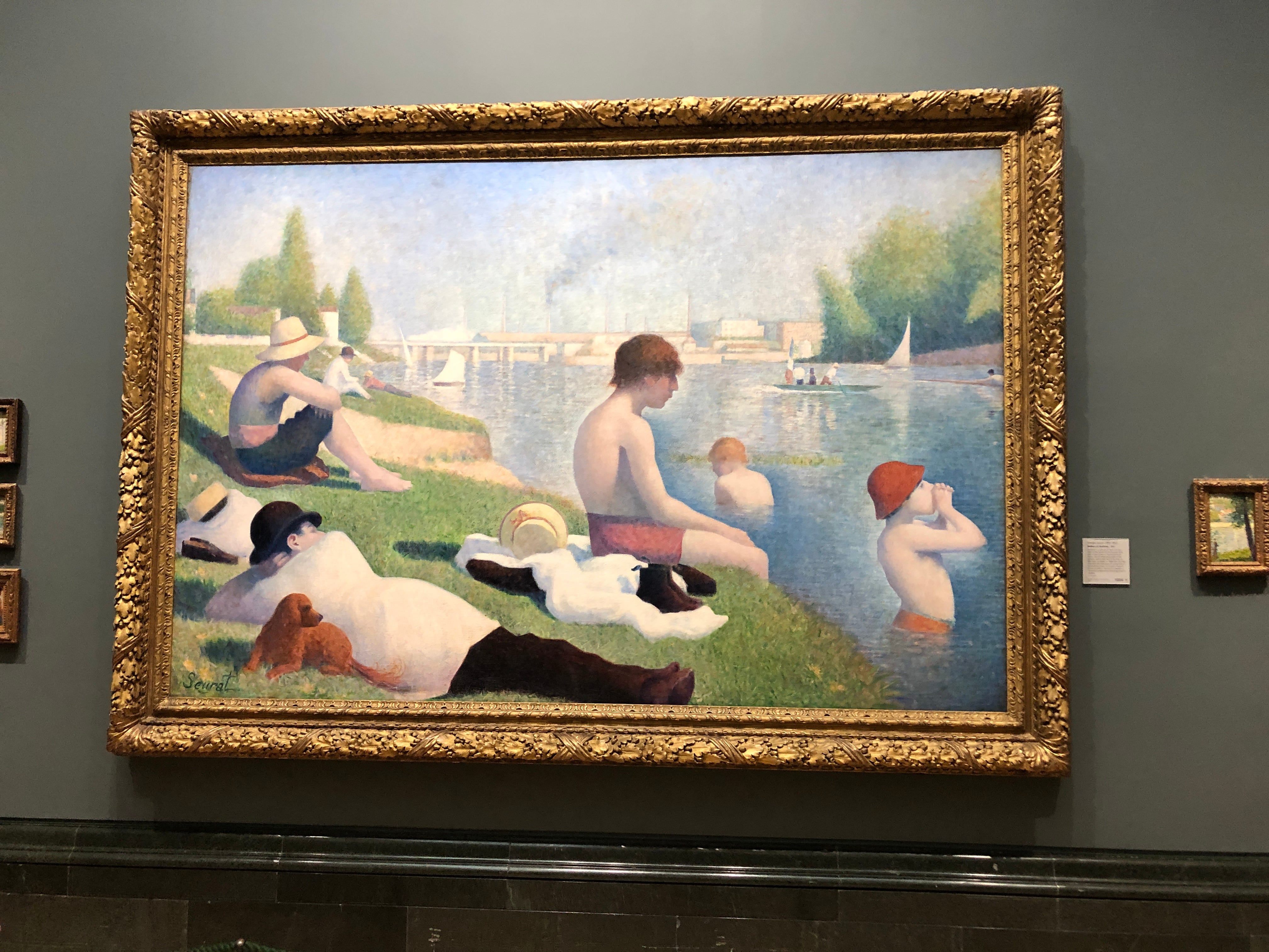
Seurat’s famous painting glows thanks to warm/cool relationships rather than any particularly-saturated colour and, like the Rubens, darks move the eye around the composition as well as giving strength to all that airy, high-key colour.

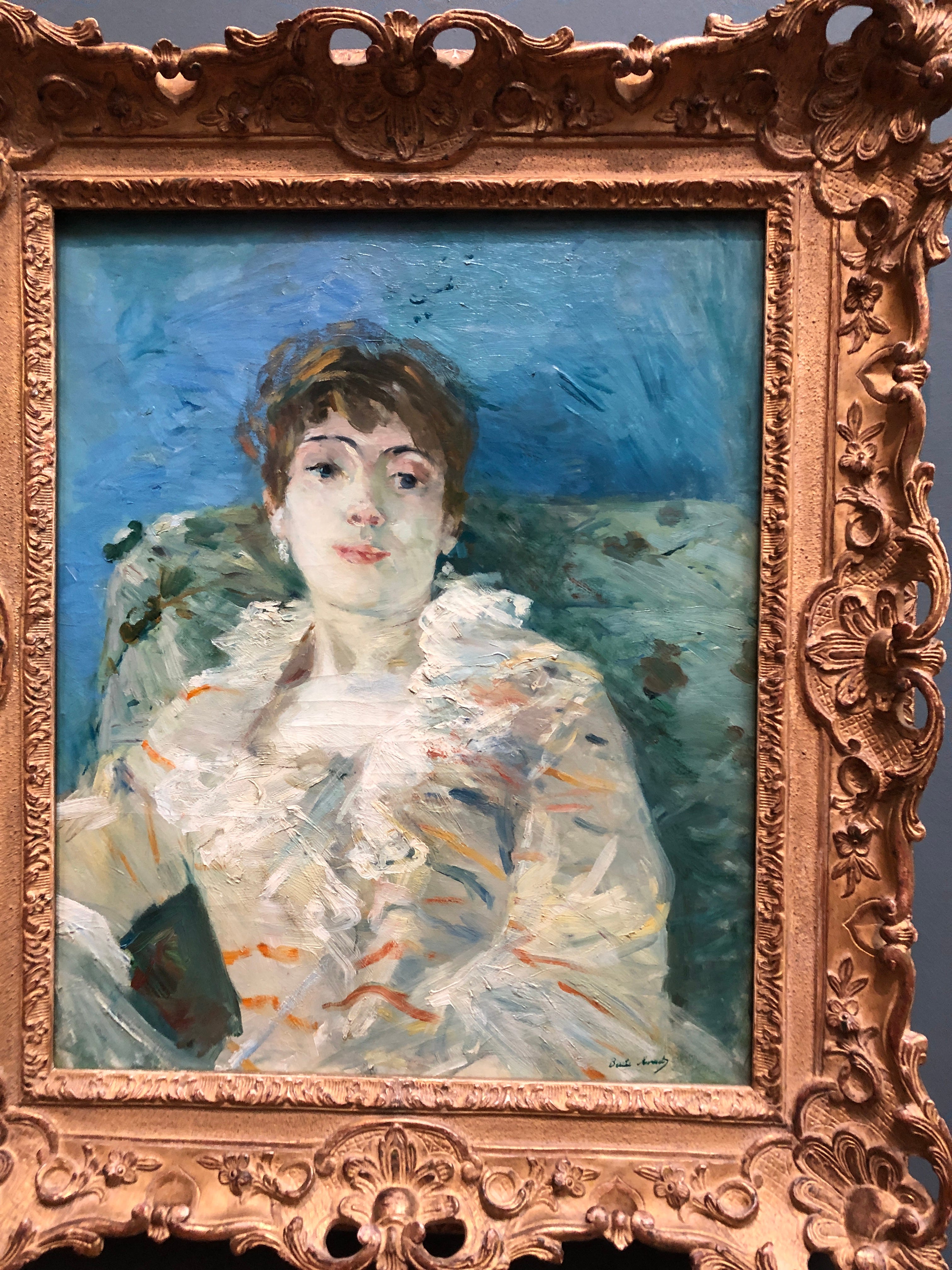
Berthe Morisot modern-feeling portrait is another miracle of limited colour and the use of warm and cool to advance or recede areas.
Everything works together to move the eye: repetition of colour, brushstroke, pattern… I’ll never get tired of this painting.
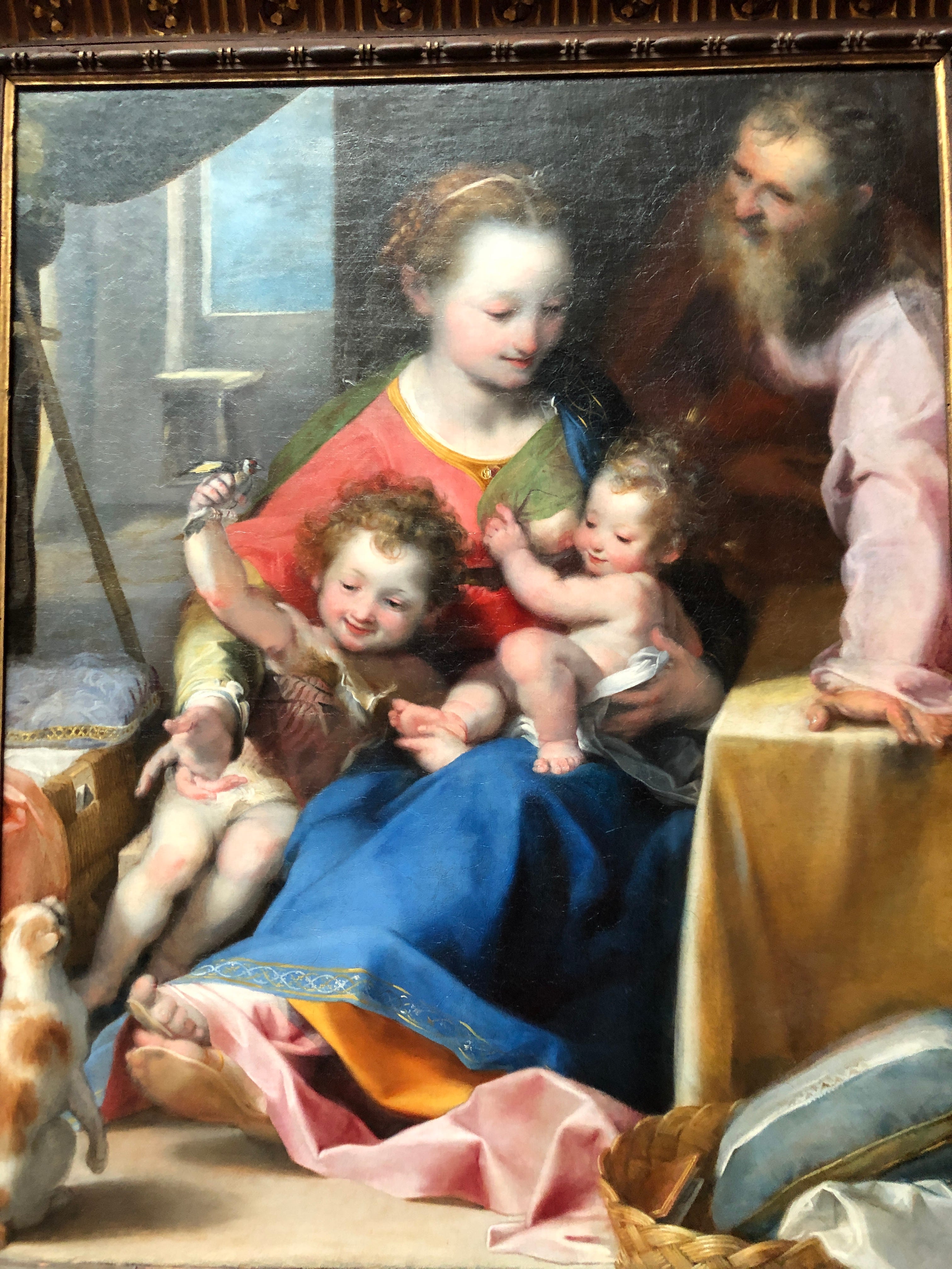
It reminds me of this luminous family portrait by Federico Barroci. If you ignore the traditional umbers of the background, the central group glows in an Impressionist way. The folds in fabrics are richly coloured, high-key, and airy and Barroci used warmth on very cool skin in a similar way to Morisot. We don’t know, of course, if her face was this green and pink when it was fresh from the studio, but I hope so.
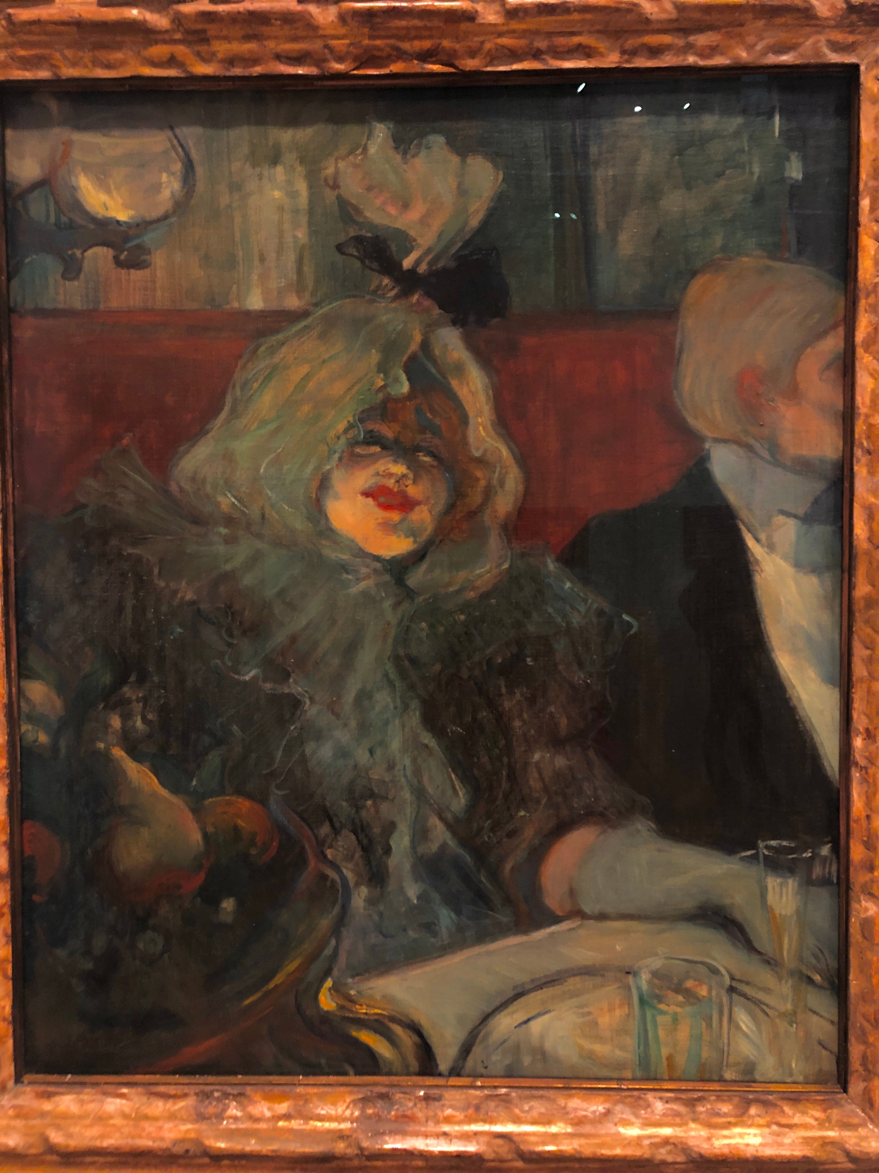
Warm and cool colour interaction is taken to extremes in this Toulouse-Lautrec. That red ear on the right is doing a lot of work to move the eye past the woman’s spotlit face. I like how the dark red background recedes despite being an intense red. Light orange on the face brings that forward through both value and saturated warmth.
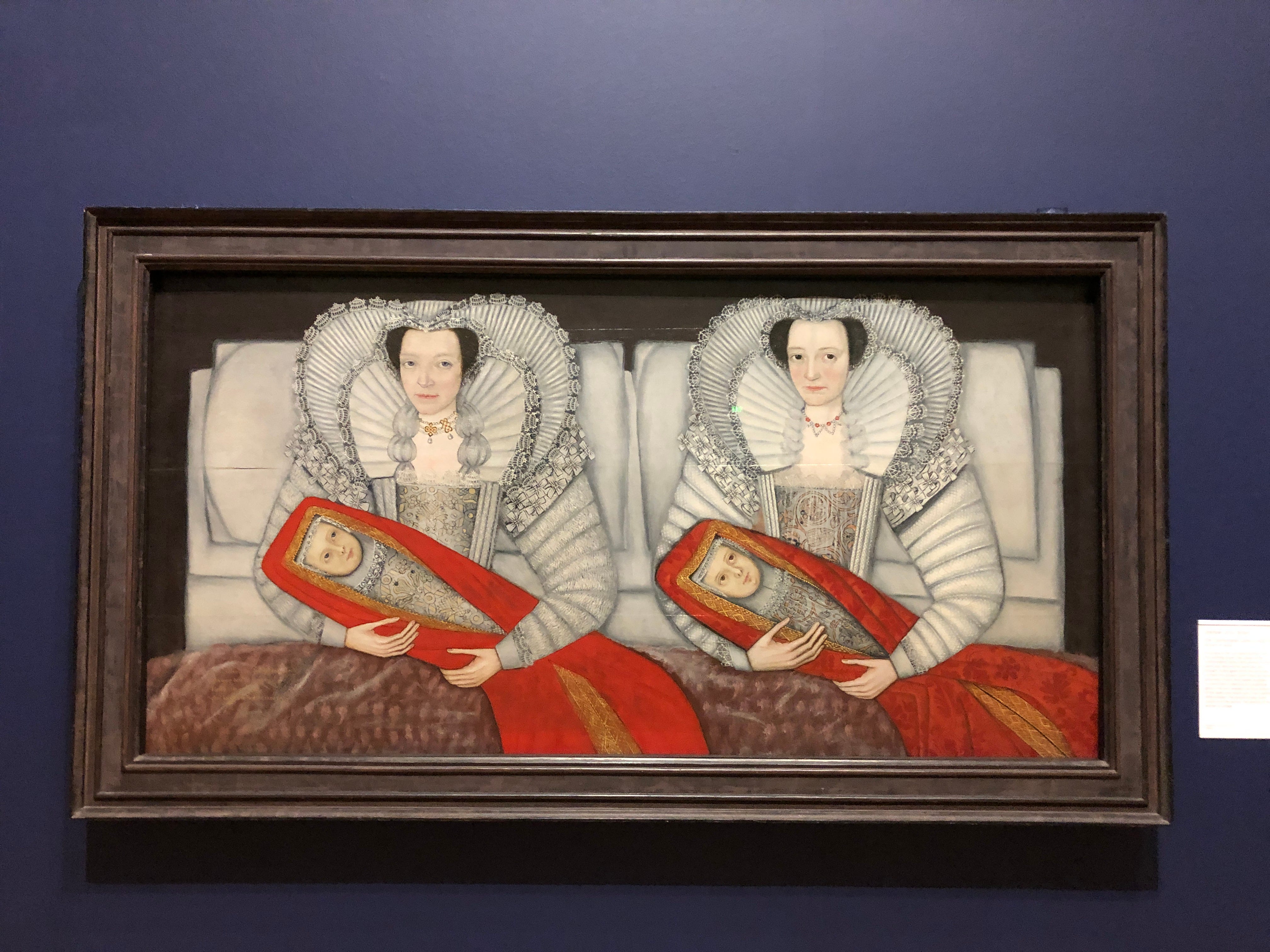
While the Cholmondeley Ladies’ red-wrapped babies pop forward in space because their light value moms’ colour can’t begin to compete. (The women were said to be born, married, and have given birth on the same days as each other. It’s a wonderfully weird painting to meet in person)
There were plenty more paintings notable for their colour but that should get your blood pumping.
Happy painting!