
Making shapes

When I go to the beach, I take lots of random photos and videos from a distance in the hopes that some portions of these uncomposed scenes will become painting references in the future. I keep my camera moving to avoid pervy vibes and pretend disinterested tourist behaviour. “Who me? I’m just taking a picture of my friend over there!”
Later, I zoom in and explore these captures, looking for small moments that contain interesting gestures, figure groupings or shape relationships.
These three people were a small, element within a larger scene. My cropping was based on an idea that the foreground woman would be the point of a future painting. image. The couple would be background colour.

Then I filed the picture on my computer in an ever-expanding folder called “in progress” and forgot about it for a decade.
Well, not totally true: it crossed my path a few times over the years as I scrolled “in progress” and each time it attracted me. I even designed a few compositions on Procreate in which the foreground woman was distanced, larger and wearing a pale sundress. Light suffused the scene from a bleached, hot sky, water shimmered and sparkled and swimmers bobbed. But I never designed something I wanted to paint so I let the image languish.
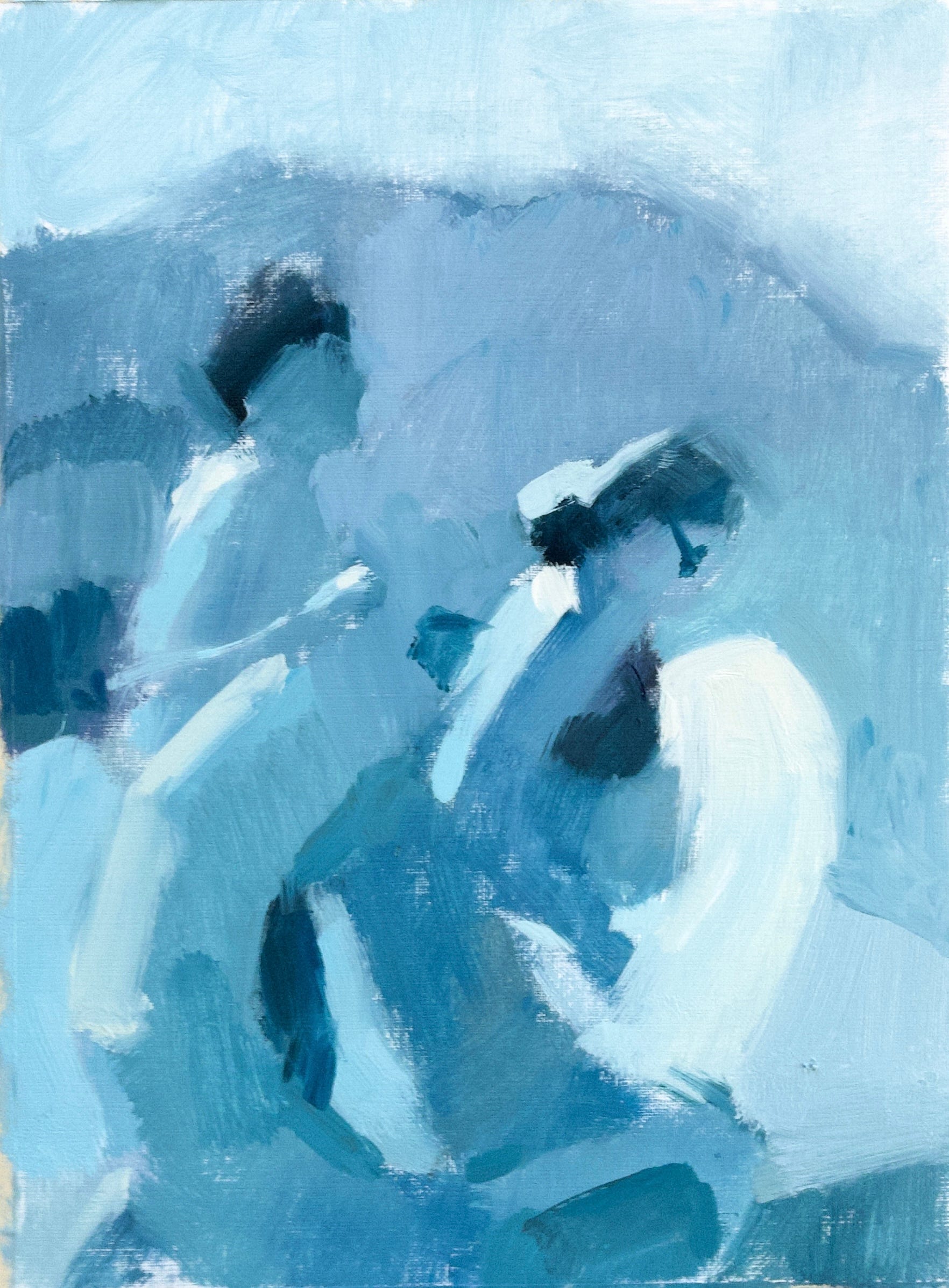
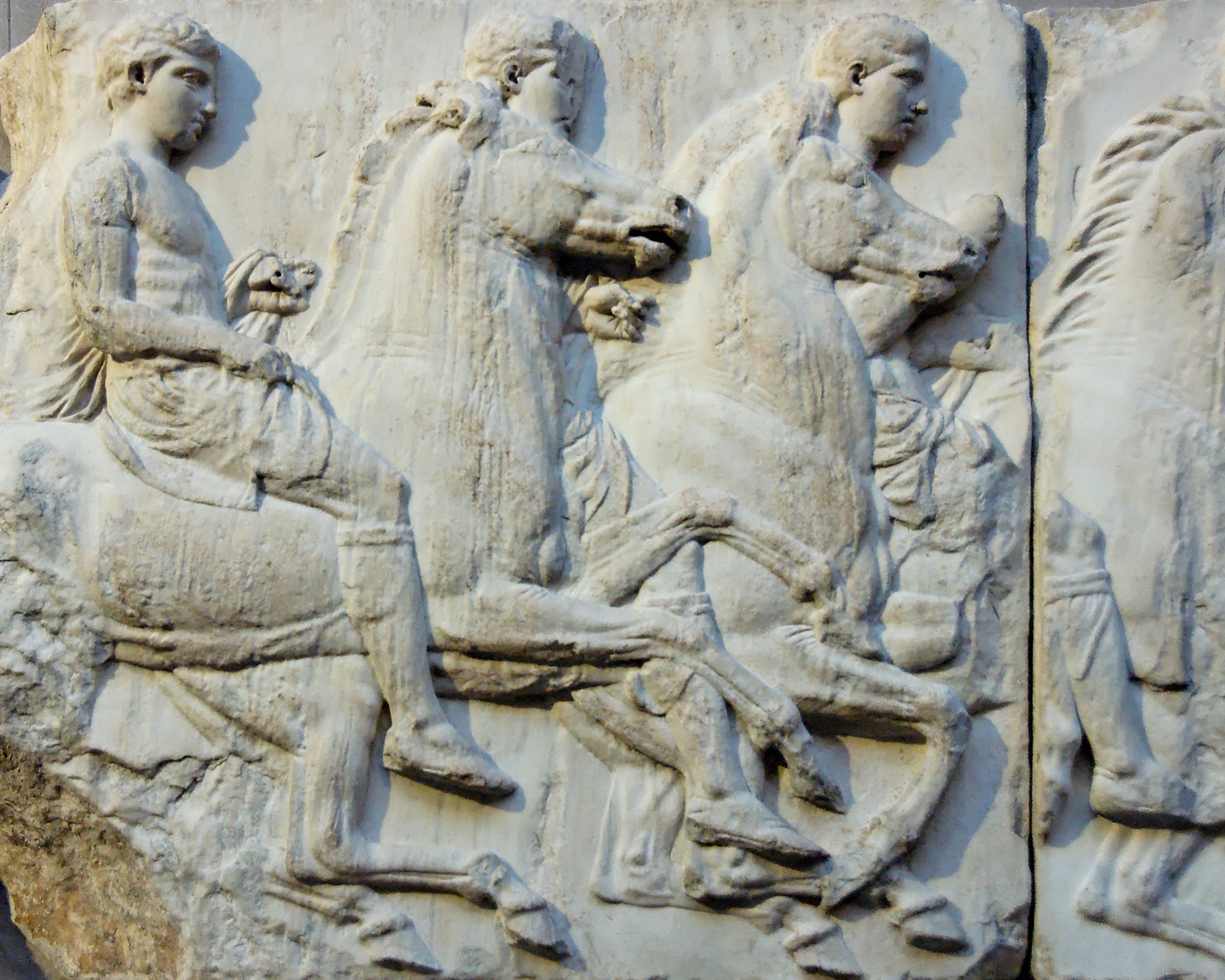
Last week, It caught my attention again but for a different reason. What attracted me wasn’t the woman, but the couple with their inflatables. I liked their gestures: the way his head is raised to look into the distance while hers watches the sand in front of her feet; the way they march across the beach in a shallow space like figures in an ancient frieze; and the light on her pink toy. It’s always about the light for me.
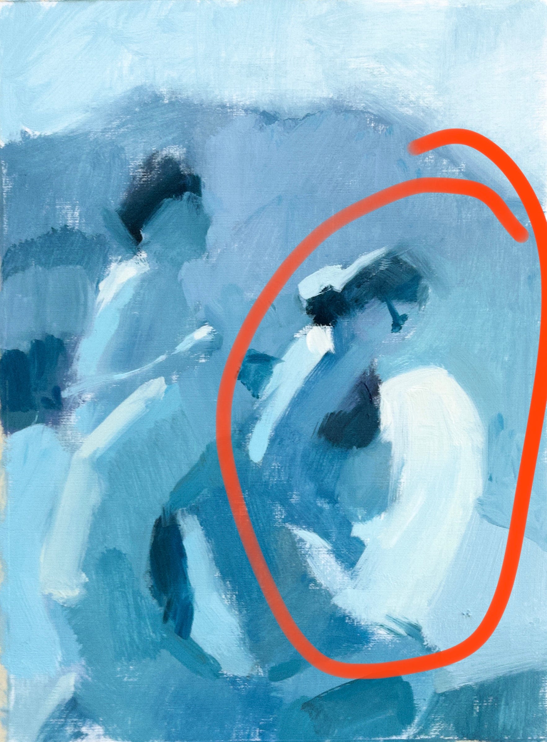
So I painted a monochrome sketch on paper to see if I could make anything of the idea. By removing colour complexity I could address it as basic shapes and values.
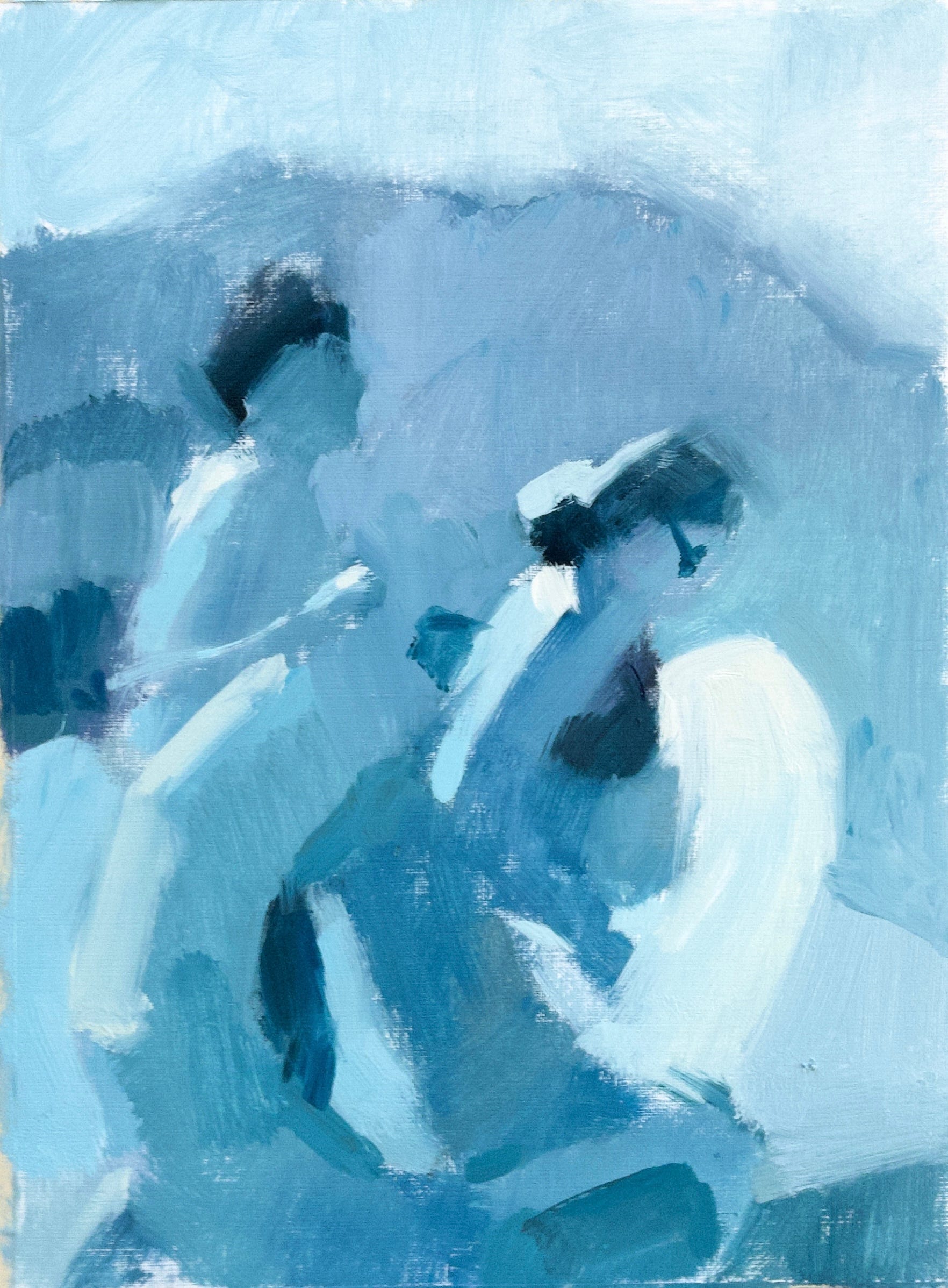
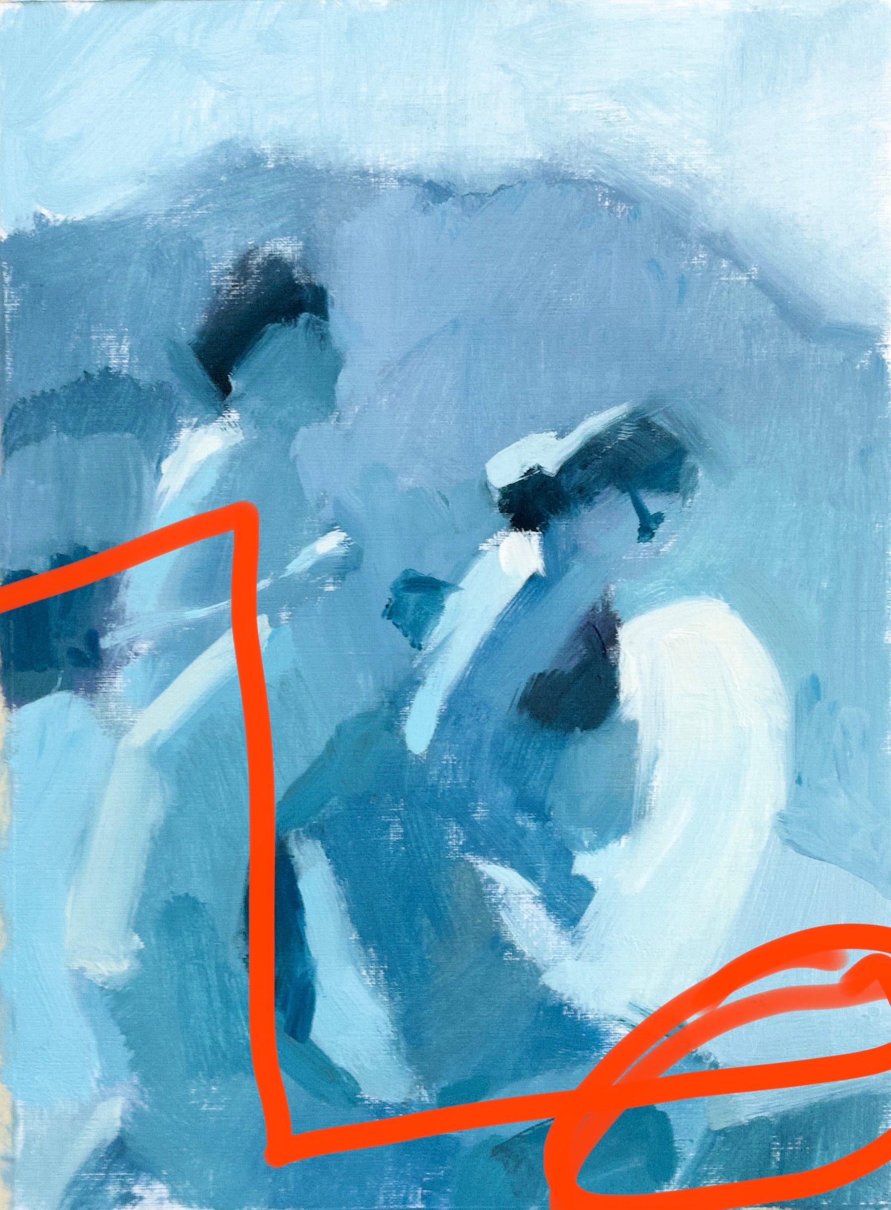
Thinking, as I always do, of a centre of interest (focal point), I emphasized the woman’s ring with light value. We’re drawn to light and it’s the easiest way to focus a viewer’s attention on a particular spot.
This was a start but it had problems. I didn’t like the way the lower right dark shape acted with the darks starting on mid-level left to create an overt zigzag shape. It created a too-obvious framing device for the woman.
So I put it into Procreate and explored ideas.
Lots of them!
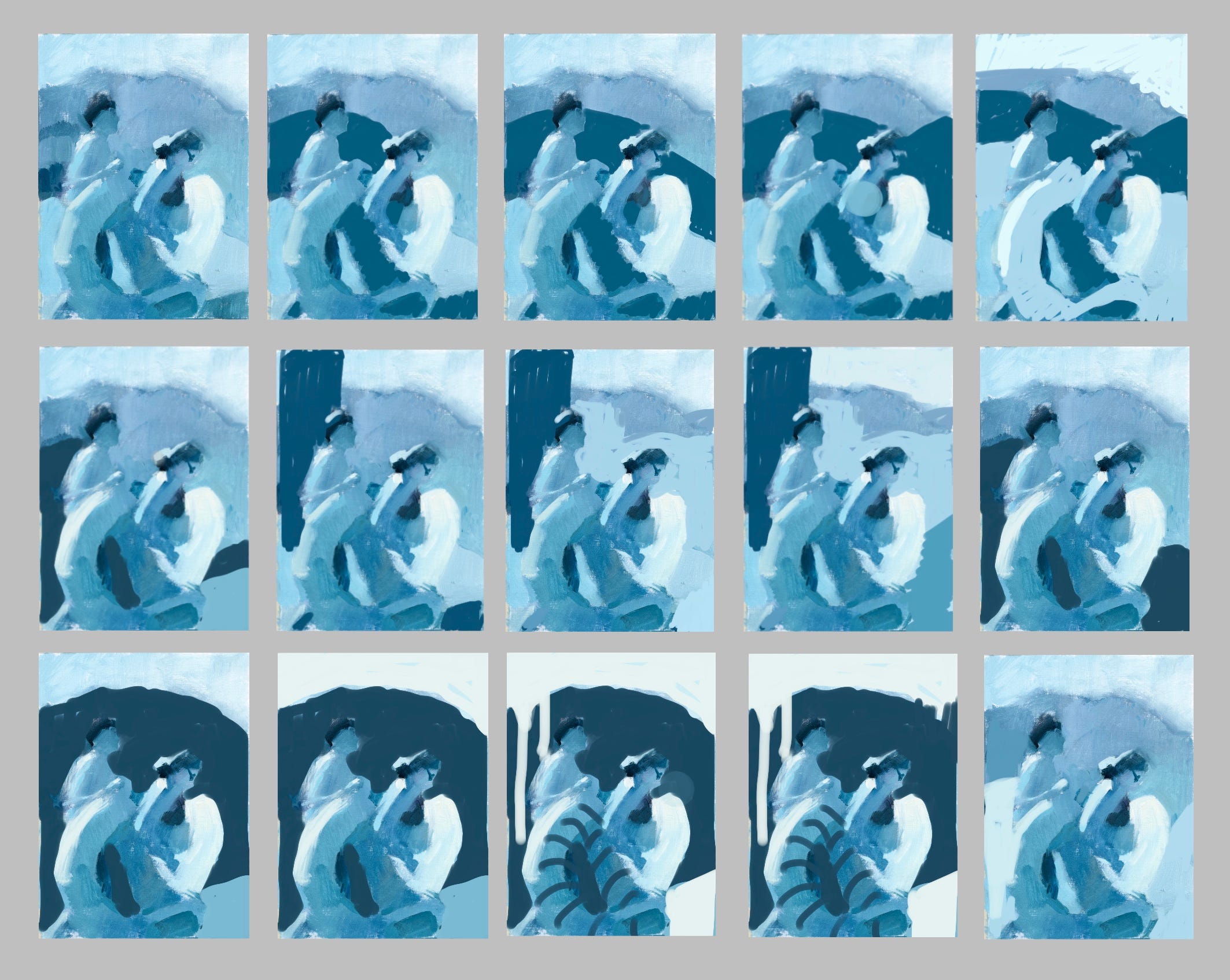
Top row:
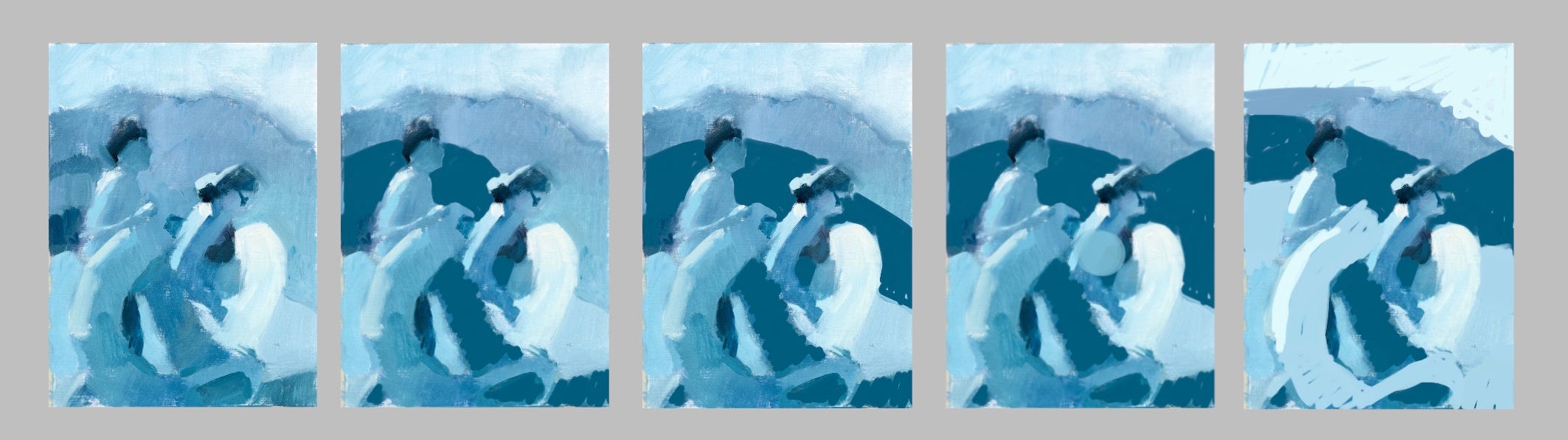
In #2 of the top row, I tried to balance the piece of dark in lower right by adding a dark element to the mountain. It led the eye to the woman and echoed the ring shape which is good. It’s satisfying to see a pattern. Wondering if that dark curve ended too abruptly on the woman’s head, I extend it to the edge of the canvas. Unfortunately, this created a line that pulled the viewer swiftly down and out of the picture on the right.
To counteract the downward thrust, in #3 I reshaped the dark, and pulled the eye up with a more optimistic energy. It also created a V at her head, once again, focusing our attention. That was good but the dark felt large and heavy. I’d lost the luminous beach vibe.
In #4, I made that distant V narrower. Instantly, the image felt lighter, airier and more appealing.
But, since digital is an easy and quick tool, I continued to explore.
Middle row:
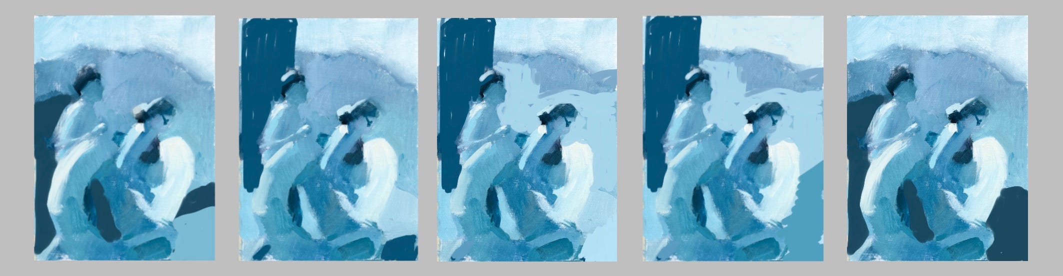
My work tends to mid values and I worry that my paintings feel weak as a result, so I pushed myself to create a full value range by adding more dark. Every alteration gave the painting a different energy. The leftmost one had a dynamic rightward movement but a disturbing sensation to the dark shape clinging to the man’s back.
In #2, I liked the vertical dark because it drew attention to the line of the man’s back but that little dark in lower right looked like something the woman would stub her to on.
In #3, I emphasized their faces by lightening the area behind them. I also got rid of the toe stubber.
#4 adds a dynamic upward movement to the lower right through a mid dark shape which also emphasizes the light of the focal ring.
#5 was a reaction to my feeling that there were just too many shapes. (*It probably belongs in the 2nd spot because it has that creepy dark shape on the left). You can see how this thumbnail simplifies the too-many-shapes issue but heavily grounds the figures. They’re slogging through dark and difficult terrain.
Bottom row:
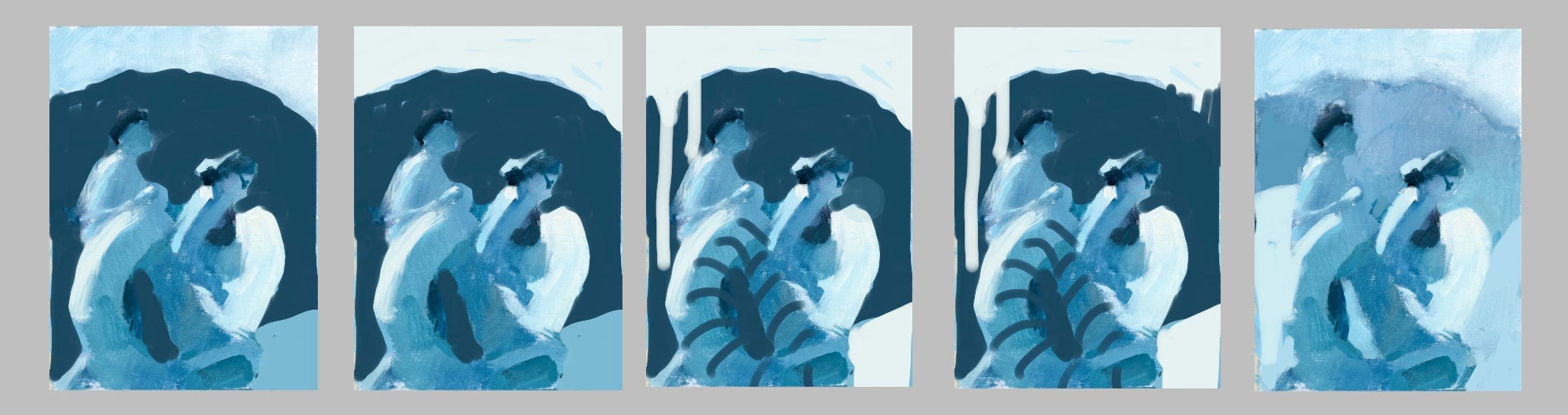
In the final row, I pushed dark in a big way, but I moved it up within the picture plane. Instead of feeling like heavy mud that the couple has to struggle through, this raised dark shape acts as a foil for their gestures and spotlights the ring. Because it’s rounded, it also echoes both rings and the curves of the figures’ bodies. All good things. It’s definitely a dramatic choice. Thumbnails 1 and 2 are identical except for the value of the sky. In #2, I lightened the sky to the value of the ring and that feels more balanced.
In #3, I added stripes and a larger piece of light in lower right. The stripes change the rate of my viewing. I slow down as I look at the many value changes on the man’s inflatable and, interestingly, that object is starting to become the most important thing in the composition. The stripes in upper left were necessary repetitions of those on the ring as stripes in only one shape felt too isolated.
In #4, I’ve changed the angle of the upper right dark and added a notch of light. It’s a small thing but it has a huge impact, drawing my eye away from the striped toy and reinvigorating the woman and her ring. That small piece of light in a large dark has more power to capture attention than all of the large stripes on the left side of the image. It balances them and draws my eye across the image. If there were 2 or 3 notches, I doubt it would work as well. Then it would feel busy. but not so strong.
And the final image shows me getting back to my mid-value happy place! I can now say that I’ve explored value options and I haven’t found one that appeals to me as much as those airy mids. They make me think of sunshine and summer.
It’s very similar to the original painted sketch but I’ve refined the weights, angles and curves of each shape. Along with an atmospheric quality, it has a satisfying repetition of curves in both the subjects and their adjoining shapes. I like it!
Perhaps I’ll paint it after I’ve played with some colour ideas, or it might end up in “in progress” again.
The time I’ve spent on these ideas isn’t wasted. I explored ideas that I wouldn’t bother with if I were composing with actual paint and that exploration ended up reaffirming my commitment to low contrast imagery. It feels right to me on a deep level. I could paint in a broader range, but I wouldn’t feel authentic; I’d be playing at being someone I’m not.
I’d be interested to know which images resonate with you.
Happy painting!
*My newsletter will always be free but if you’d like to support my writing, I’d be honoured if you’d buy me a coffee:)
It’s so interesting for me to see your process. I learned something from each of the changes, but the one that strikes me most is from the initial photo to your innovation of it…such a lesson in using photos! I have seen many artists tweak a photo and bump up values/colors, but I would not “see” your value study in the photo you took. Amazing transformation!
You are a great artist and an excellent teacher.
Thank you!
I love all the detail you described about each one. We learn by seeing through your eyes. Thank you!