


Doing more with less
The purple conundrum

“Painting is the ability to surround Venetian red so that it looks like vermillion.” Degas

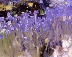
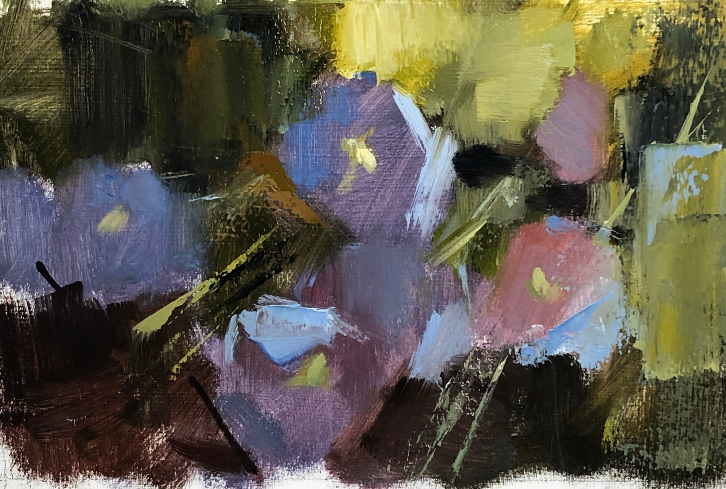
Painting 1. Pigments used: everything but the kitchen sink
I painted this piece outside, striving for all I was worth to capture the little purple bells in their shady spot, slightly touched by sun. Purple is a cool, recessive colour and my usual double complementary palette looked dull and not up to the task when I tried it. Soon, I found myself pulling out big guns like dioxazine purple and quinacridone rose and using them with abandon. Pthalo blue also played a big role.
In the end, it’s an ok effort but I’m not thrilled at the number of very saturated pigments I had to use to get this result. Those pigments were a desperation move, like tossing a handful of chilis into a dish because it tastes uninteresting. It won’t be boring after the chilis go in, but it won’t be subtle, either. I wanted to see what a more subtle approach to the subject would yield so I spent a day in the studio trying different options.
Prepare yourself: paint nerdiness to follow.
First, I went back to my usual palette, figuring that I could make more considered choices in the controlled environment of the studio as compared to the 29C, mosquito-infested backyard.
My inspiration was this iris picture by Bato Dugarzhapov in which the humble purple sings because it’s next to very low chroma yellow leaves and also very rich dark. The yellow next to purple is complementary interaction at its most effective while the strong dark makes use of value contrast. Purple is made to look light next to that black. The result is the illusion of light and high chroma but the purple doesn’t rely on unusually saturated pigments.
It’s a genius piece! Sorry I couldn’t find a larger image of it.
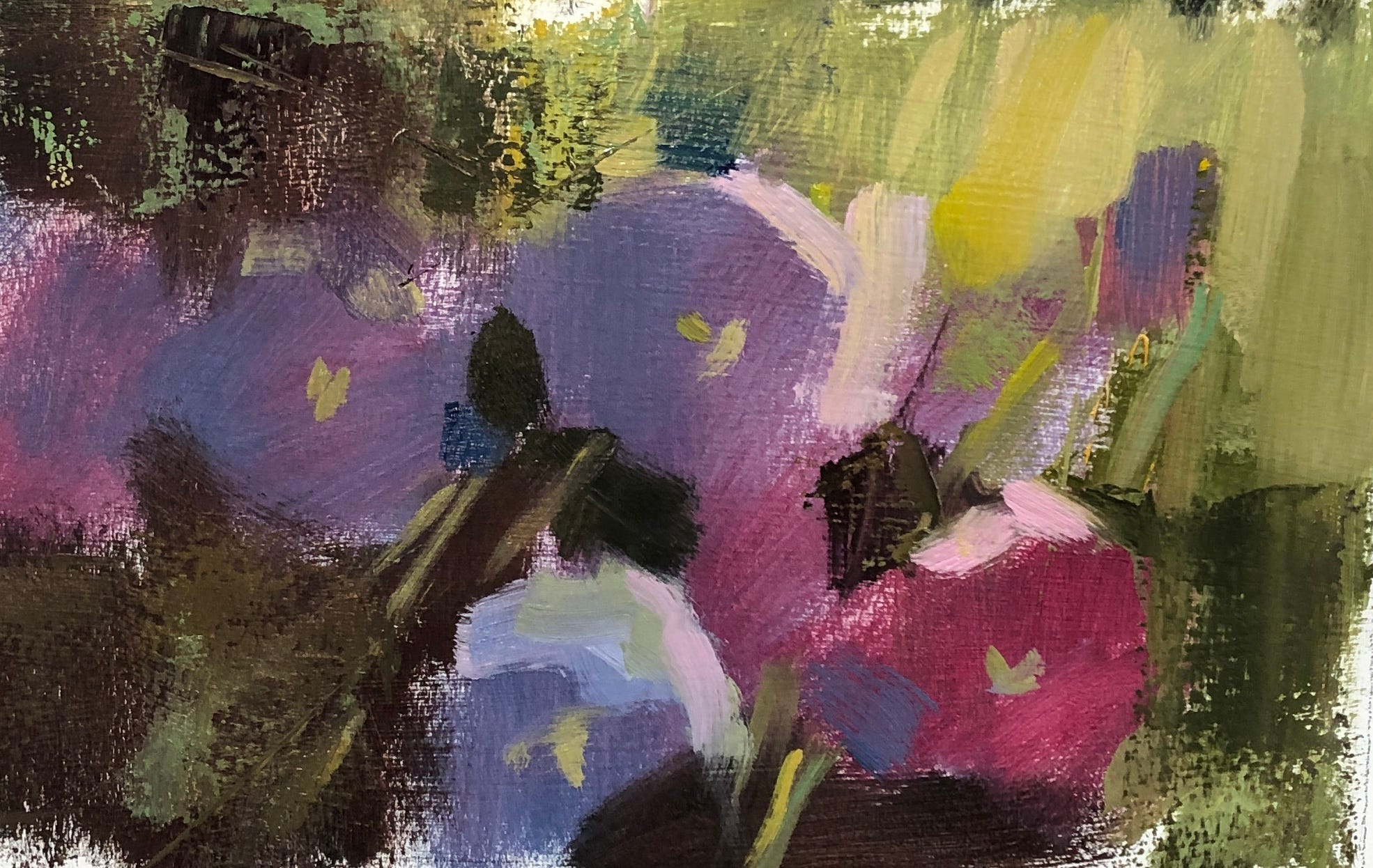
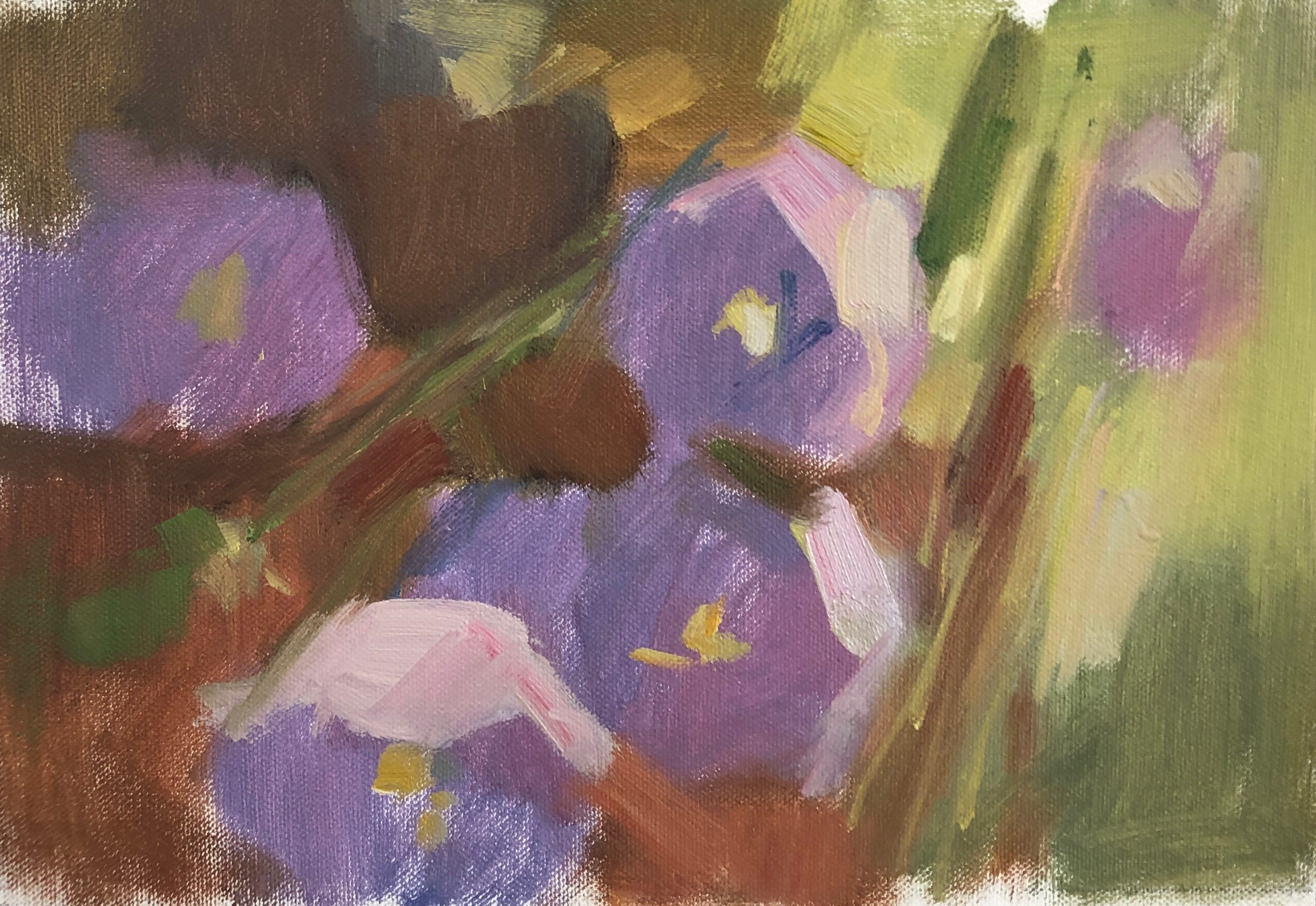
Painting 2. Pigments: cad red light, alizarine permanent, ultramarine blue, pthalo blue, cad yellow, cad yellow light, mars black, titanium white.
This didn’t turn out too badly though, in looking at it now, I’d grey the yellow further and use cooler highlights on the flowers.
I kept the basic value relationship of the plein air piece but lightened everything by a step or two so that the flower colours entered the middle values more firmly.
Colour is at its most attractive in the mid values. At the top and bottom end of the value scale, they read primarily as lights and darks instead of colour. Hence the struggles I had in the plein air painting. In an effort to capture the rich, but naturally- dark hue of the flower, I keyed the flowers very dark. The only way to make such dark colours come to life was to hit them with intense pigments.
While painting 2 works, I’m still relying on highly saturated colours which is fine for such a small painting but can be a visual car crash in a large-scale work. Still too many chilis.
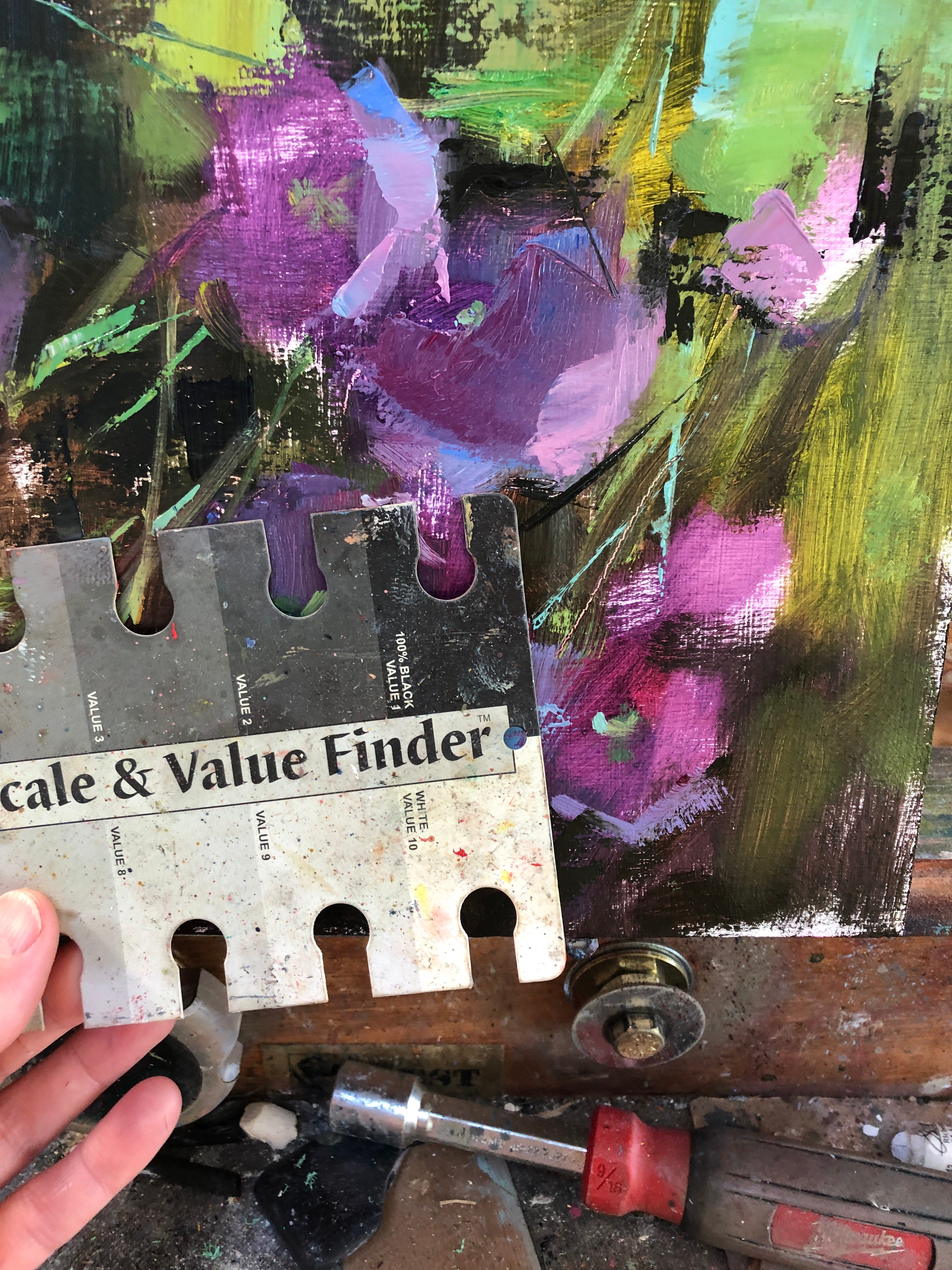
Next I tried using mainly low chroma pigments.
Painting 3. Pigments: terra rosa, kaput mortem violet, mars black, ultramarine blue, cad yellow, titanium white
It’s moody but effective. The value range is about the same as painting 2. I relied heavily on the darks to make this one have impact since the colours are so dull. Still, I kind of like it. I’m a fan of greys.
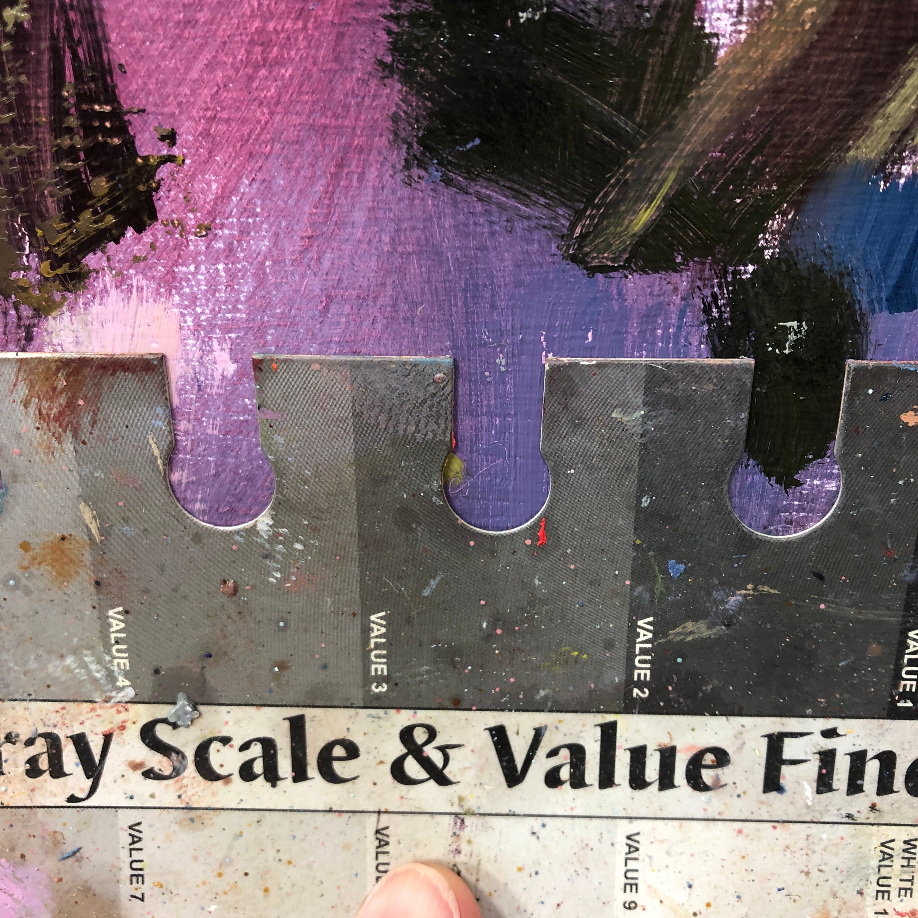
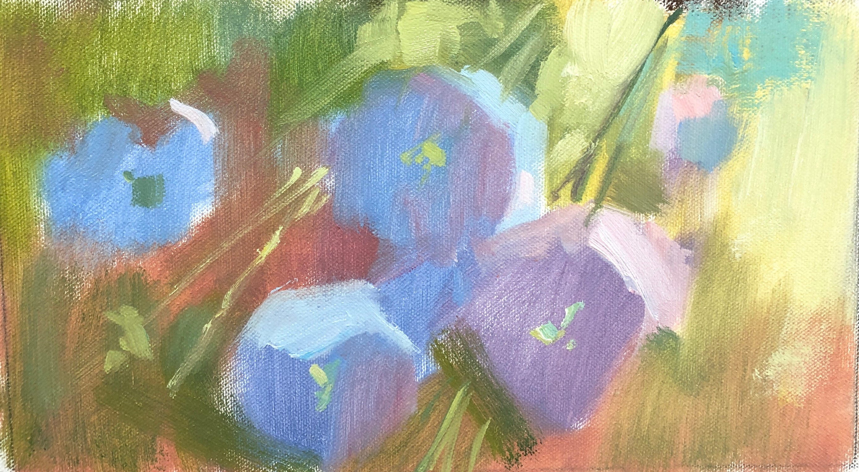
For the fourth painting, I went back to the painting 2 palette but raised the overall values, including those darks.
Painting 4. Pigments: cad red light, alizarine permanent, ultramarine blue, pthalo blue, cad yellow, cad yellow light, mars black, titanium white.
What I like about this one is the identifiable colour in the darks. The shadows feel a bit airier and there’s a some glow due to the warm/cool interaction of the flowers and the red dark.
My final experiment - not because I ran out of ideas, only that I wanted to stop painting purple bells and felt I’d learned enough for the moment.
For this fifth painting, I restricted myself to a higher key in which nothing was darker than mid value. The palette was the same as the previous piece but I used white liberally, as well as using my cadmiums to lighten the reds and greens.
Painting 5. Pigments: cad red light, alizarine permanent, ultramarine blue, pthalo blue, cad yellow, cad yellow light, mars black, titanium white.

I like it. The colours sing and keep their identity while an overall sense of airiness and summertime also comes across - more than in any of the others.
The problem with high key paintings, however, is that they can seem weak and insubstantial, so I added a few crisp darks to counteract that. I could add more but you can see how those few dark accents have already given the image a bit of strength and edginess.
Pigments: cad red light, alizarine permanent, ultramarine blue, pthalo blue, cad yellow, cad yellow light, mars black, titanium white.
So, the winner is?
Well, that’s the question. Ask me tomorrow and I’ll have a different answer than I do today.
What an experiment like this does is show me how many options I have in any painting. I don’t need to use saturated colours at full strength to paint a floral, I just need to paint smarter. As a bonus, playing with the saturation and value of this simple floral, gave me new ideas for a figurative piece that’s been stalled. The time that these studies took was well spent.
I’d be interested to hear which of these five pieces catches your eye and why. Leave me a comment and let me know.
Happy painting!
I love the first painting! I also love how you make us all think and continue to share your knowledge and personal painting journey with us. Thank you Ingrid.
I loved your entire process of using the same subject, yet, making it look “different.” I plan to use your approach in my own paintings. I believe and hope it will help me grow and improve in my creative journey. I personally liked your first painting and the last one with the added dark accents. I much appreciate your self-critiquing as it helps me understand what and why you made your changes. I strongly related to your example of the chilis, but describing it in the artistic sense. That was really “cool” and then again, that was really “hot.” LOL!