
Composition: patterns and focal points
Can you have both?

I’ve been thinking a lot about composition since my focal point newsletter last week, and I’ve realized I have two definitions: the usual one, and my own personal one.
The usual definition is that composition is that it’s how a painting is structured: where the shapes, colours and values go inside the rectangle. Composition determines how shapes are balanced, weighted and related to each other; whether they flow smoothly across the canvas or bump, nudge and overlap.
Composition also describes how the eye moves through the rectangle: zigzagging from one edge to another, circling or spiralling, radiating from a central point, dashing along diagonals or wandering along sinuous curves. It determines the pace the viewer’s eye travels - from speedy to meandering - and where the eye pauses or moves easily along.
Composition is not the nameable stuff in the painting. It’s not the people, ponies, clouds or fields. It’s what decides where the people and ponies go, how large they are, how close together, how light or dark, how much they overlap, and how much each one matters. It’s the bones underneath the subject.
How-to painting books usually talk about the familiar compositional setups: massing, cruciform, S curve, J curve, tunnel, etc. They’re dependable methods and they work. You can put your people and ponies into one of these structures and the painting will feel reasonably composed because our eyes already know these arrangements. They’re comfortable and familiar.
But some painters choose more challenging ways to organize their shapes and those artists always catch my attention for their creativity and bravery. They push what composition can be and make me look at their paintings more closely and thoughtfully. And isn’t that the goal?
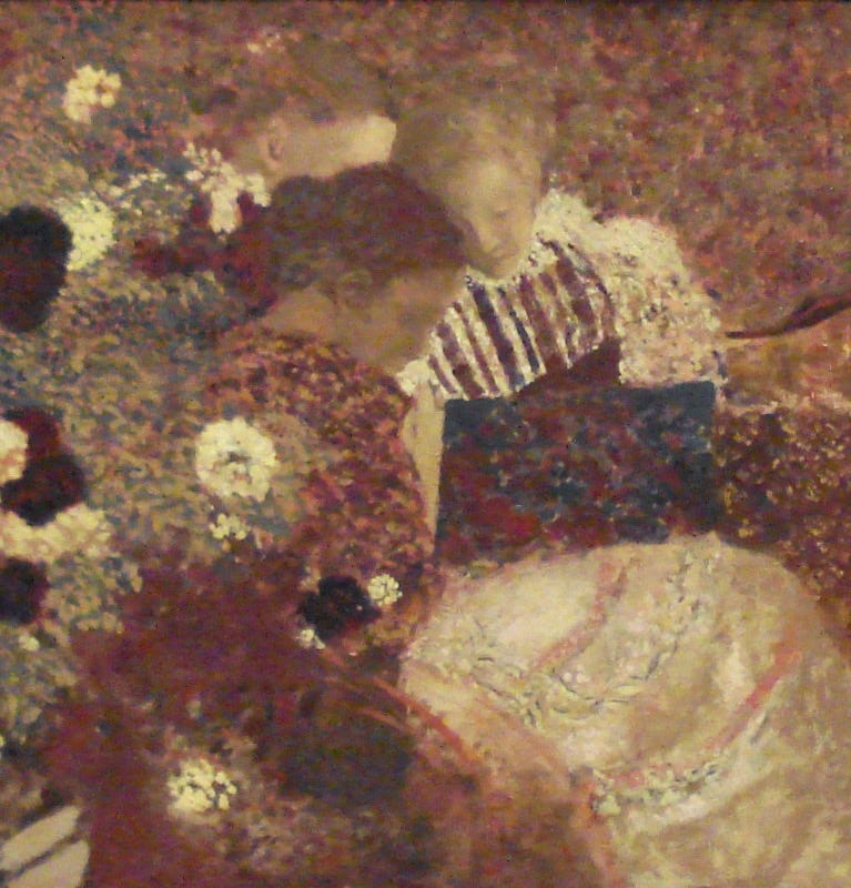
Vuillard is one of the great painters whose patterned compositions always hold my attention.
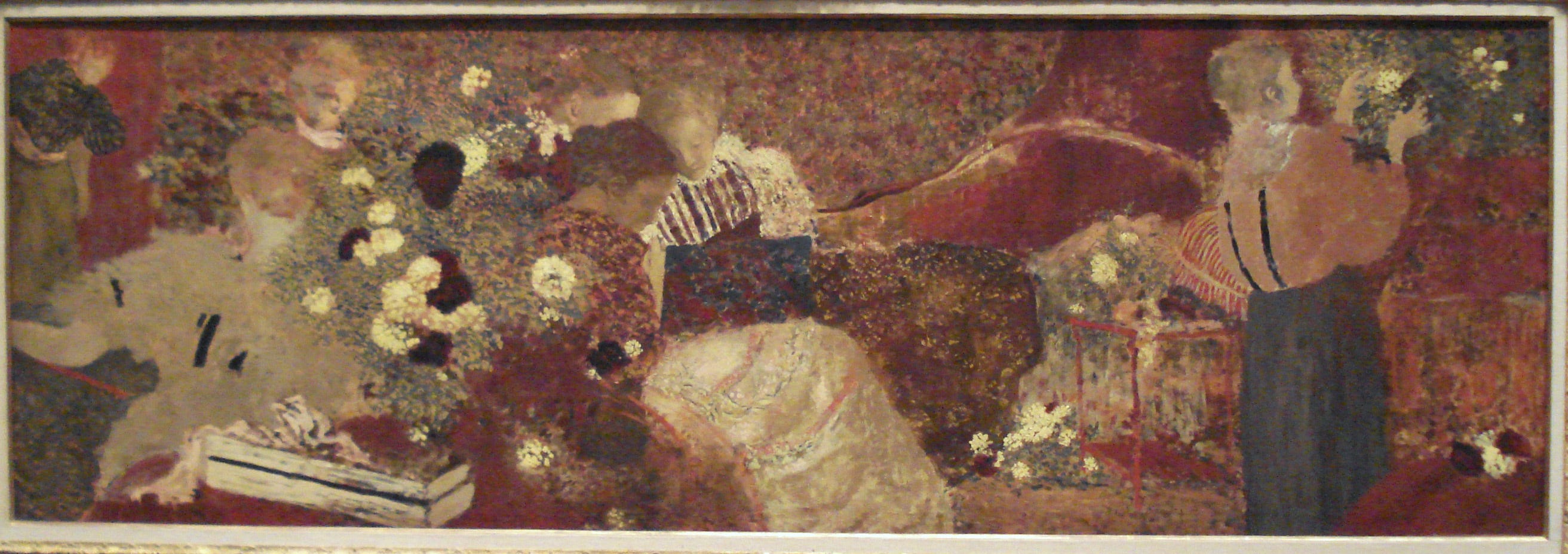
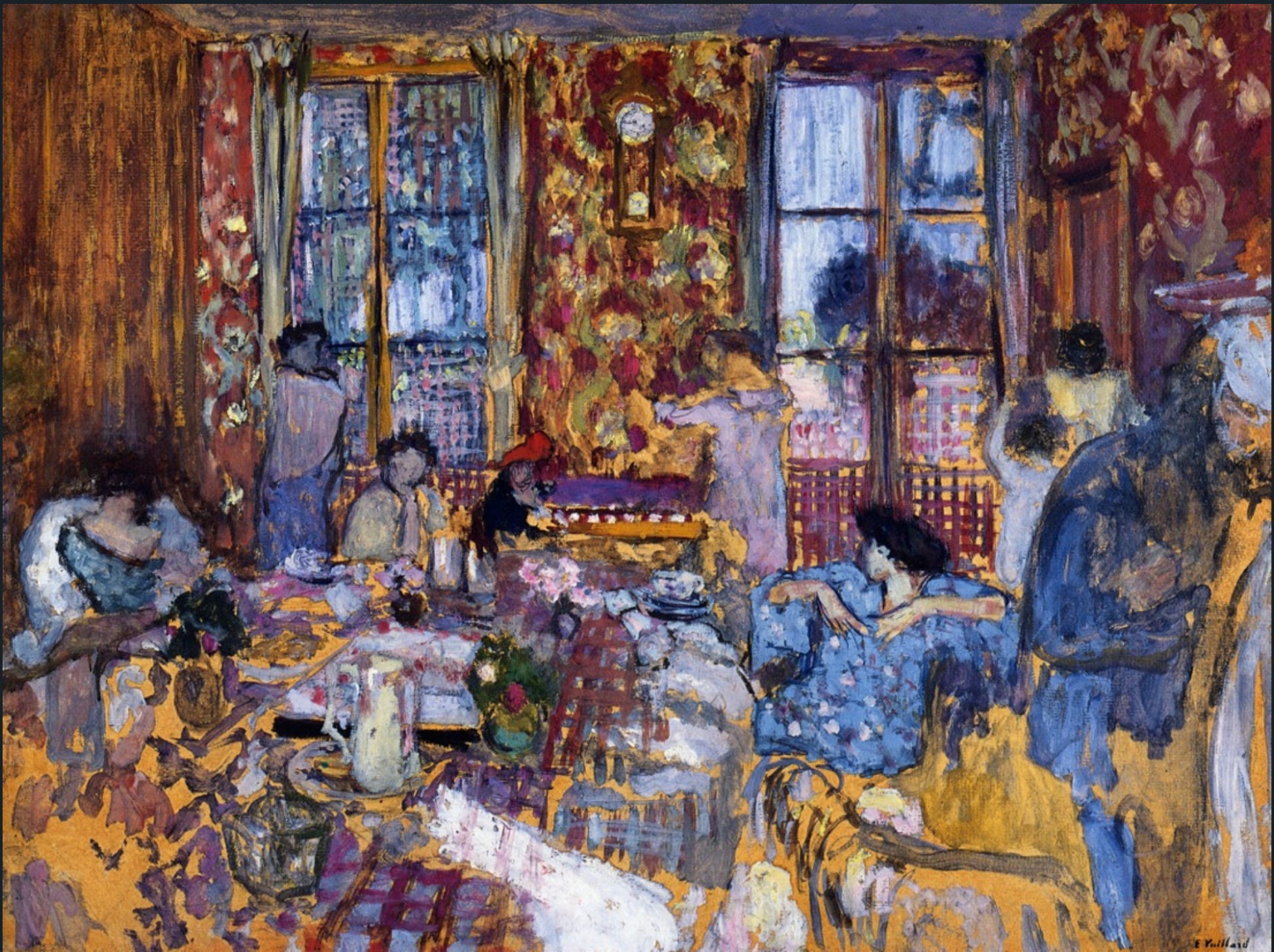
I saw this painting at the Metropolitan Museum years ago and was transfixed. At first, I liked it for the colour harmony, rhythm, brushwork and shapes variety. It felt more abstract than representational. But I also liked the way it encouraged me interact with it in order to understand its subject. I knew it was representational but it wasn’t like any interior scene I’d seen before. I scanned and squinted, trying to find the people and things that the artist crammed into this chaotic space. I searched for the story that held it all together.
Eventually, I started to see it as the busyness of a genteel household: women sewing, reading, arranging flowers, talking and, off in the corner, bustling out to get dinner started. A whole day of domestic activity compressed into one image.
The composition doesn’t reveal itself all at once. First I noticed the little light shapes scattered across the room: flowers, sleeves, skirt. Then I saw the darker reds and warm browns moving across the painting like a wave, leading to the standing woman on the right. She’s a simple upright element who manages to balances all the activity on the left and stops the eye from sliding out of the painting.
But I don’t think she’s the main point of the piece.
My eye keeps returning to the the pale-faced woman in the middle Her crisp stripes, the white flower beside her, and light skirt make this space seem more important than the rest of the image. In my mind, she and her surrounding white notes are the focal area, centre of interest, or whatever label we want to put on her.
This markup shows how I move through this composition:
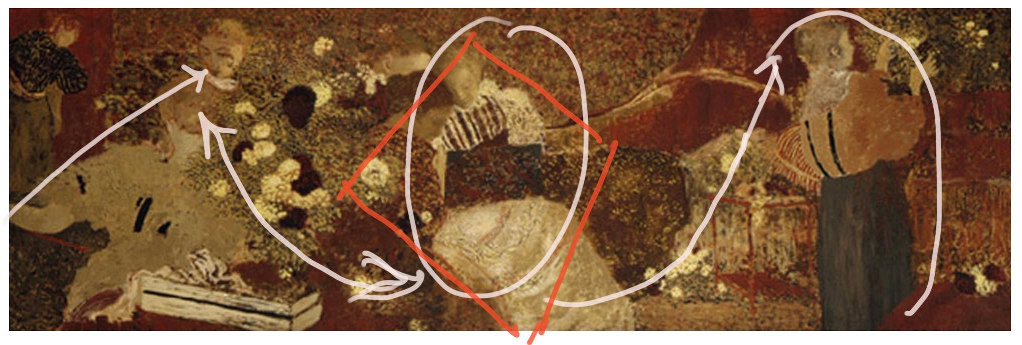
Vuillard used pattern and movement across the canvas to organize many of his interiors. Sometimes he has an overt focal point:
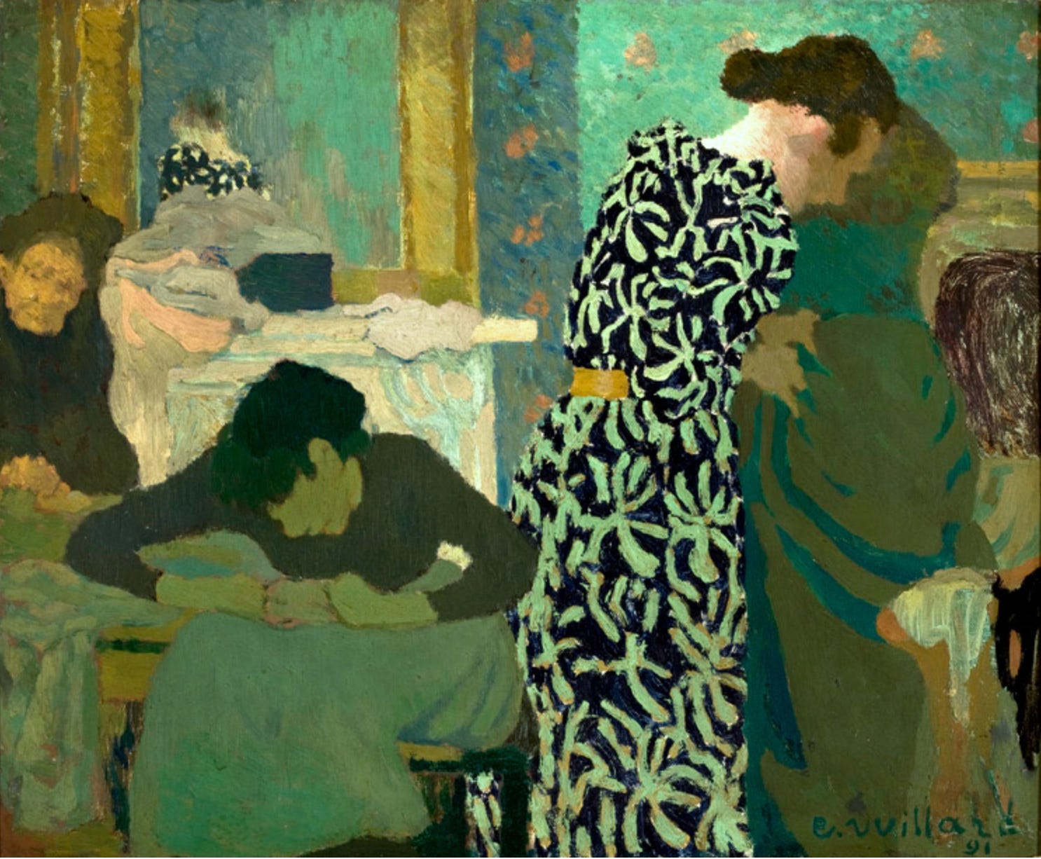
And sometimes he doesn’t:
And yet I still think there is always a focal point. Or at least a focal area.
That’s the personal view I mentioned at the start.
In realist painting, I think every image will have a place where the eye rests longer than it does anywhere else, and to which it keeps returning. It might not be as dramatic as a face or the thing that the painting is “about” but somewhere in the image, the artist will reveals a preference. We’re human, and we can’t help but like some parts more than others. One shape or area will be made more compelling because of stronger colour, greater contrast or sharper edges. There may be several areas of interest, but we’ll get a sense that one of them is more important than the rest.
Abstract painting can work differently. As far as I can tell, they’re a wild and free bunch who know no rules and paint with total freedom. Exciting!
In the Vuillard above, I think the focal area is the woman in blue. She takes up a little more space than the others, has clearer colour, and is refined just a bit more than the chaos around her. She’s where my eye keeps landing and, if I cover her with my finger, the painting loses focus and feels more like clutter than a composition.
Susan Lichtman is another painter who uses pattern in her work. Her interiors are full of repeated shapes, flat colour, ambiguous furniture and figures and patches of direct and bounced light. My eye moves everywhere but I still feel that she’s singled out certain areas for special noticing.
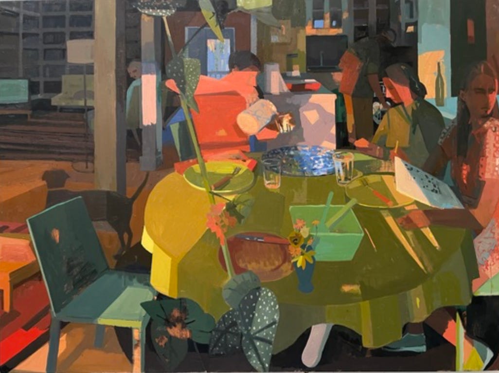
In this paintings, my eye goes straight to the bright edge of the tablecloth and the chair and plate beside it. Intellectually, I want the focal point to be a person, because people feel more important, but my eye doesn’t care what I want. It goes to the strongest contrast and colour; the place with the most visual pull. I believe that Lichtman planned for me to see it this way. She singled out the beauty of the light on a yellow tablecloth and made me notice it and admire.
When I paint, I always think in these same terms. Everything on my canvas should be worth looking at, but one area should merit a longer look. I construct a hierarchy of interest and never allow two things to capture the same degree of attention. That means that my paintings go beyond showing the literal subject of the work - the ponies and people - and reveals something about me. I’m telling the viewer what I consider to be the most exciting part and hoping to make them see it the same way I do.
Finding that area in an another artist’s work is one of the pleasures that I get from looking at art because it lets me feel closer to the artist’s process and decision making, as if I’m watching them apply the paint. I see what they emphasized or diminished and what they wanted me to pay special attention to - even if they didn’t announce it loudly as in the classic idea of the focal point. I get to know the artist through their preferences.
So, yes, I’m a focal point person (I actually prefer focal area person, thank you very much).
I know the Instagram poll in last week’s post puts me in a small, select group (16% of us!) but I embrace my status. A focal area gives meaning to my compositions and makes sense to me in the work of others.
Feel welcome to show me screenshots of work that has no focal area. I’m always willing to see the other side.
Happy painting!
*I love sharing my thoughts about art in these newsletters and they’ll always be free. If you’d like to support my efforts, I’d be honoured if you’d buy me a coffee:)