


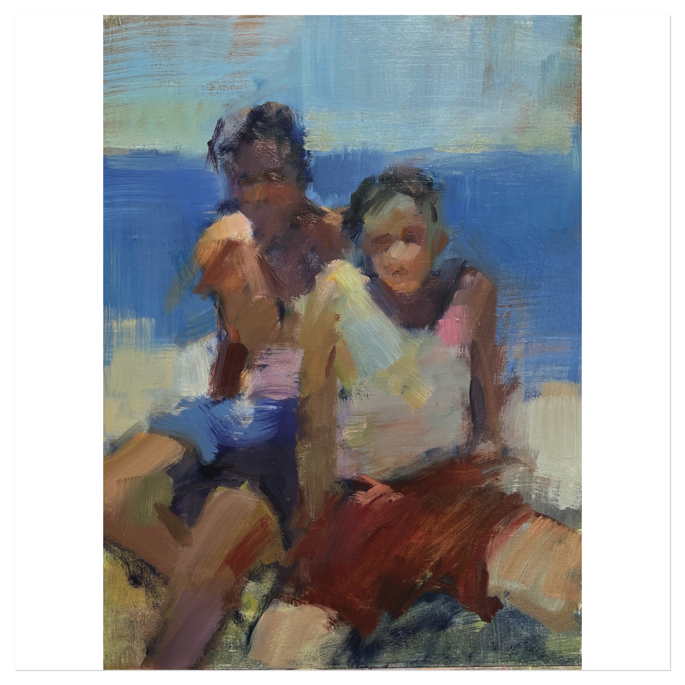
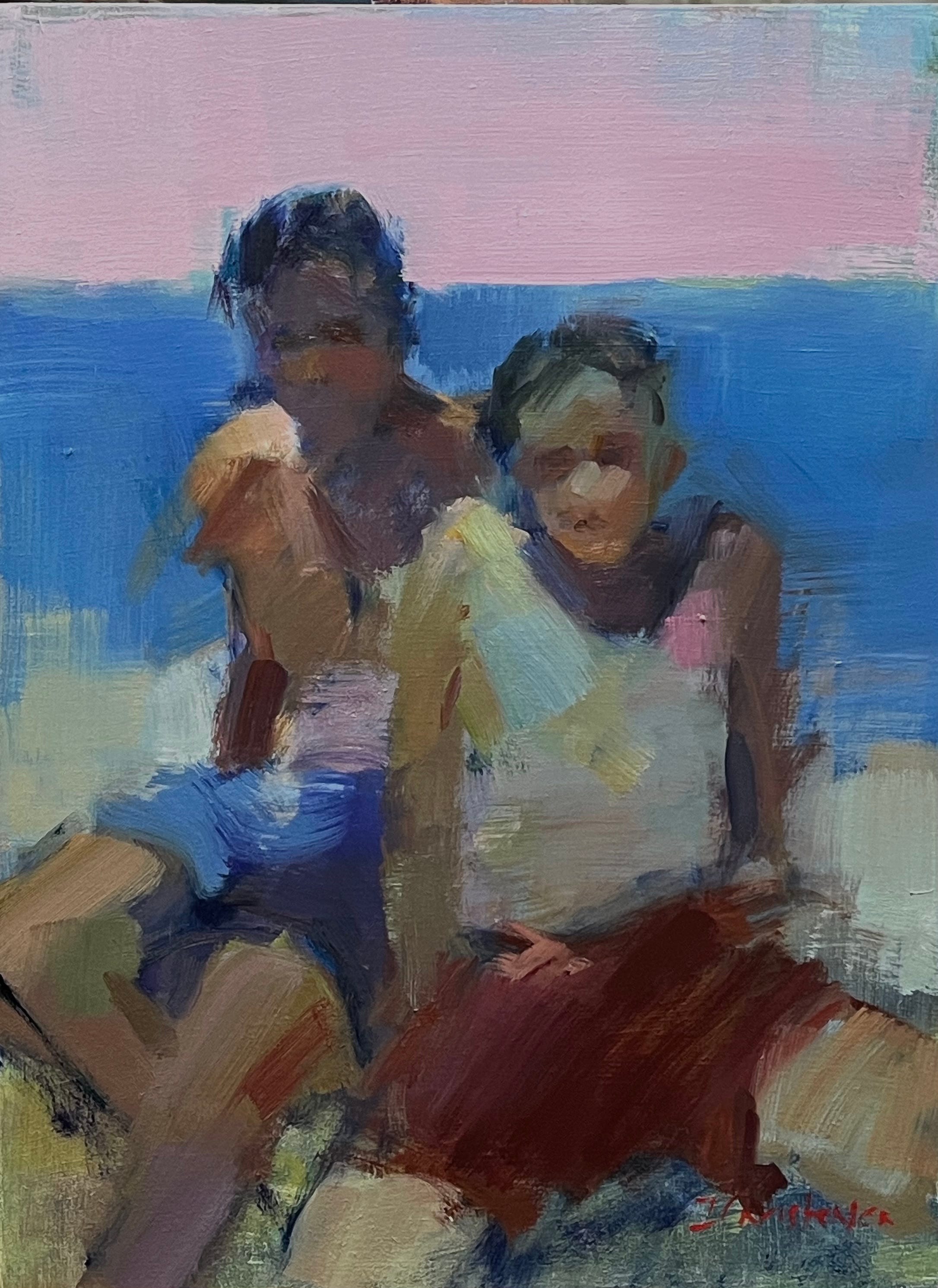
Balancing colour temperature
Before and After

This was painted on top of a failed painting that was predominantly green and lavender.
I’m a fan of paint overs because they launch me straight into a painting without having to build the paint film and colours that a blank panel requires.
The downside of a paint over is that it can trap me in a colour space that I’ll struggle to get past later. Which is what this one did.
That cool, greenish start made me respond in kind, especially when I drew the placement of the boys with a cool, dark blue. And I echoed the underlying lavender by using purple in the shadows on the boys’ faces and chests. It wasn’t even a conscious decision, just a response to what was already there; an instinctive drive toward harmony.
The result was that the painting felt too cool - though not at first. I loved that harmonious colour space immediately after I finished it. It felt contemporary and it didn’t conform to the reality of the photo reference which was all ochres and warm siennas. I prefer interpreting rather than copying a photo’s colours but it’s often hard to ignore what’s right in front of me as I paint.
But, after I’d gotten a couple of days’ distance from the piece, the overall greenish blue hue began to bother me because the painting felt imbalanced. But how to fix it?
In this case, I was reluctant to alter the boys because they were working well, so that left the environment..
The sky seemed too light in value and was making the boys look very dark by comparison, so I decided to alter that shape. Because the blue, green, and purple families were overused, I looked to the warm side of the colour wheel: yellow, orange, and red. I liked the novelty of that piece of alizarin-based red on the front boy and reusing a colour creates harmony, so I considered that hue right away.
My next decision was value. I felt that the boys looked too dark which was largely due to the big, light sky behind them. So the sky needed to become darker but it couldn’t be as dark as the sea or the two shapes would be hard to separate.
I chose to make the sky the same value as the highlight on the tall boy’s shoulder which meant that I was keeping a simple, small number of values overall which is a good thing. It also had the benefit of allowing me to make a richly-coloured mixture rather than one that was freighted with a lot of colour-deadening white.
Starting with pure alizarin and white, I slowly added green to diminish the saturation, testing it against the painting as I worked. When the resulting mixture was neutralized enough that it didn’t shout, but not so neutralized that it felt lifeless, I grabbed a big brush and changed the sky in a brisk minute. Very satisfying, too, let me tell you.
Paintings are endlessly interesting to make because I use all of my brain: the intuitive and the rational throughout the process and I’m drawing on years of knowledge and experience with every brushstroke. I’m never on autopilot and the process has never become boring or rote.
I know that when I write that, I’m talking to you, too:)
If you’d like to take an online workshop that tackles painting with every brain function you have, there is still one space left in The Figure, Graceful and Loose and three spaces in Painting Shadows: an In-Depth Exploration. I hope you’ll join me!
Happy painting!